
Recently updated on November 17th, 2023 at 03:59 pm
Ever wondered why Earth is the unparalleled planet in the galaxy, mainly because of its ability to facilitate lifestyle. Our terrestrial zone is now essentially comprised of inactive devices. We can’t imagine one single day without our cell phone or laptop or any other favorite device. It seems like our life has stopped if we have to function without any of these devices for a single day. That is the kind of dependence that these devices have drilled into our lives. Now in this technical era with enhanced technical developments web developers need to change the way they operate. Sites nowadays are vital to promote businesses and to make sure that your web page can now be viewed through any device is essential. Not just viewed but viewed perfectly should be the objective of web designers which initiates the Powerful need of a Responsive Web Designing
Device-Agnosticism
Whenever a new device comes into market, websites are impacted in some way or the other and quite simply there is no way to predict what is going to be the next launch. So in this ever changing era of devices, display of website has become ever more important.
The increasing use of internet supporting devices has lead web designers to create responsive and such websites that will meet all limitations of a device in which they are being used. But adopting a device agnostic approach is not as easy as it sounds.
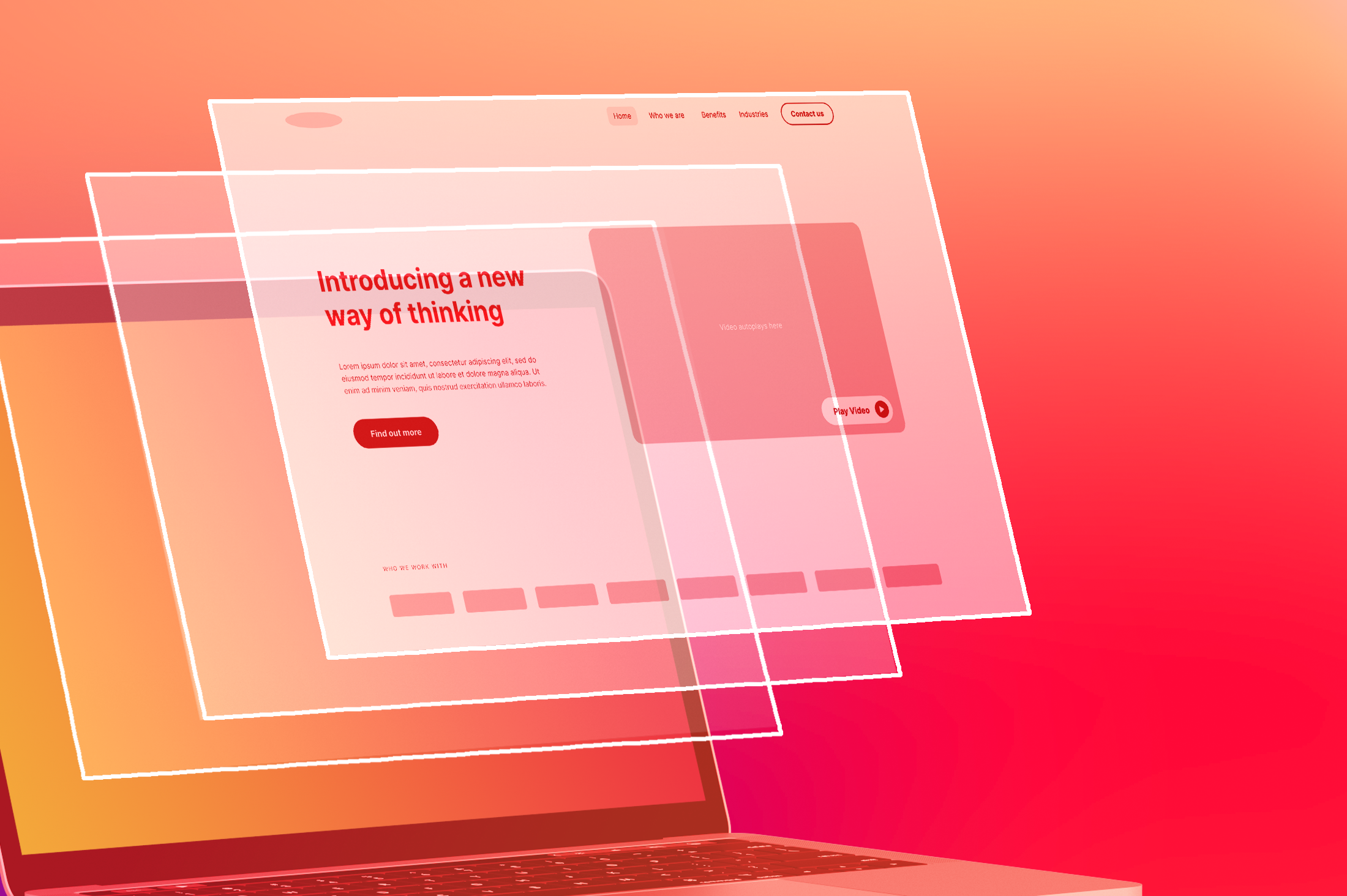
Now what exactly is Device-Agnostic Approach? Well it simply means not tied to a particular machine, similar to device-independent. In other words, the site you build should be independent of the device it will be displayed on. Responsive designing is basically a flexible approach of designing for the web and not a particular device whether it is mobile or a desktop.
A hot prospect in Web Designing industry
Presently, we hardly see anyone without a Smartphone or phones that support Android like iPhone, iPad and all. And people rarely bother to turn up their PC’s or laptops when they can do the same work from their phones. For the success of your website you need to make it flexible, versatile and make it suite every platform. The technology is here and the name given to it is Responsive Wed Designing . No matter what the screen resolution and dimension is, a responsive web will display best results everywhere.
The uniqueness of the concept of Responsive Web Designing is hard to overlook and it is rapidly gaining momentum. It has now become an essential element of the repertoire of web designing firms. Even Google is now recommending online marketers to go for Responsive Wed Designing. According to experts, due to its immense benefits, utilization of this technology will keep on increasing with time and soon supersede all the other web designing technologies.
Since the use of cell phones to access internet is no longer a novel trend, it can be concluded that all websites should be designed using an agnostic approach. Responsive Design and Device Agnosticism are the term which reflects spotlight on the device instead of the user. You should rather work on fulfilling the needs of the users instead of focusing on the need of the device because the existence of websites is all about satisfying the needs of the users not the device!
Responsive Design is a way to make it easy for the user to perform the tasks. Ultimately, if web designing was a movie, content will be the star, design will be the supporting actor and the purpose of the whole things will be to provide the user with viewing pleasure.
Also Read: Embrace Responsive Web Design-The New Era of Web Designing


