
Recently updated on November 17th, 2023 at 03:59 pm
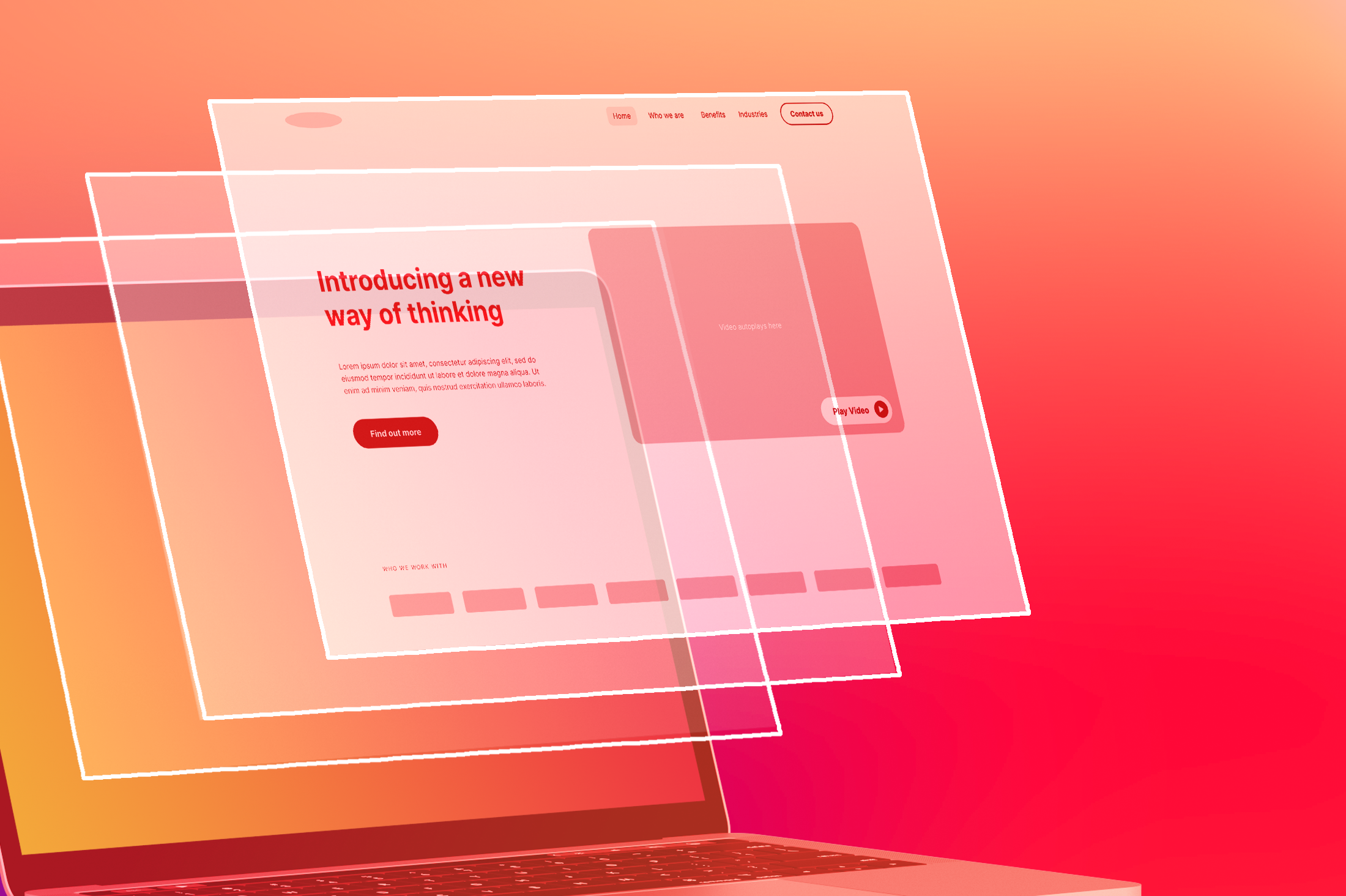
Building responsive sites does not have to be rocket science, especially if you have knowledge of the tools that will help you. With more people wanting to have websites that can be accessed with any device from desk top machines, to laptops and mobile phones , the introduction of responsive web design was inevitable.
Responsive web design is a web design approach that aims at crafting sites to provide an optimal viewing experience. It focuses on easy navigation and reading with a minimum of panning, resizing and scrolling. This approach suggests that design and development should respond to the user’s environment and behavior based on platform, screen size and orientation. As the user switches from their desktop to their mobile, the website should automatically switch to accommodate the image size, resolution and scripting abilities of the mobile. To date, there are over 50 tools that can be used to build a fabulous responsive website but the focus for now is going to be on the top 10.
1. Responsive Web Design Sketch sheets:
These help web designers to map out how they can change page sections in different resolutions.
2. Golden Grid System:
This is a fluid system that serves as a starting point for a responsive web design by enabling the website to serve good looking pages that range from 240 to 2560px.
3. Responsive Wireframes:
An experimental tool which was created by James Mellers of Adobe, this tool is built with only HTML and CSS which web designers can use to visualise how their responsive design would look like on actual browsers for various desktops and mobile devices.
4. Style Tiles:
This tool gives a designer a way to develop an idea of how a website would look like. It gives the designer an opportunity for a perfect responsive design workflow and the ability to integrate client feedback.
5. FitText.js:
This is a small javascript tool that allows auto resising of text and headlines when the browser window is resized. This tool ensures that there are no more worries of text size mismatch.
6. Respond.js:
This is a fast and light weight script that mainly enables responsive web design in those that don’t support CSS3 Media Queries for example IE browsers.
7. Variable Grid System:
This tool is designed and developed by SprySoft and it is based on the 960 Grid Systems. This tool allows the developer or designer to generate the custom grid and then download the accompanying CSS file based on that grid.
8. Isotope:
Isotope is another amazing tool with jQuery plug-in that has proved to be useful while designing a responsive web design. This tool helps to rearrange the elements of a page when the browser window is resized or the screen size is smaller and also helps to filter these elements.
9. Bootstrap:
This tool was created and animated by Mark Otto and Jacob Thornton. It is an excellent set of user interface elements, javascript tools and layouts that are free for download and use in web design projects
10. Fluid Grid Calculator:
This tool helps a designer or developer to quickly grab the CSS of their fluid grid website design.


