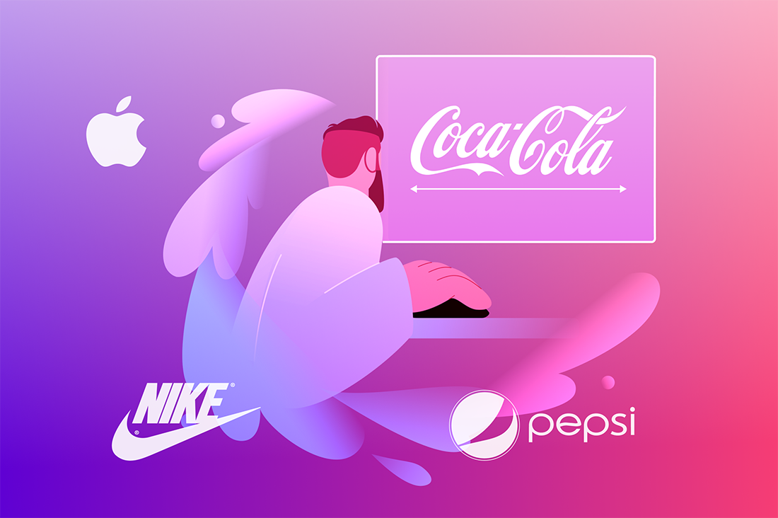
Brand identity is crucial for standing out in a saturated market. It’s more than just a recognisable logo or catchy tagline; it’s about establishing a consistent and memorable presence that truly connects with your target audience. A compelling brand identity can set you apart from competitors, build customer loyalty, and forge a deep emotional bond with your audience.
Let’s explore what makes an example of brand identity exceptional by examining key strategies and successful applications across various industries.
Key Elements of a Strong Brand Identity
Logo
Colour Palette
Typography
Visual Style
Brand Messaging
Voice and Tone
Next, we’ll look at how famous brands utilise these elements to create strong and cohesive brand identities.
What Are Iconic Brands?
Iconic brands are those that have successfully established a strong identity, emotional connection, and cultural relevance that resonates deeply with their audience. They go beyond their products or services and become symbols of values, aspirations, and experiences.
These brands are not just market leaders; they represent a lifestyle, evoke emotions, and are often seen as cultural icons. Their ability to connect on such a profound level is what makes them truly iconic. Effective digital marketing plays a key role in keeping these brands relevant and distinct from other brands.
Next, we’ll look at how famous brands utilise these elements to create strong and cohesive brand identities.
Examples of Brand Identity
 Simplicity and Elegance

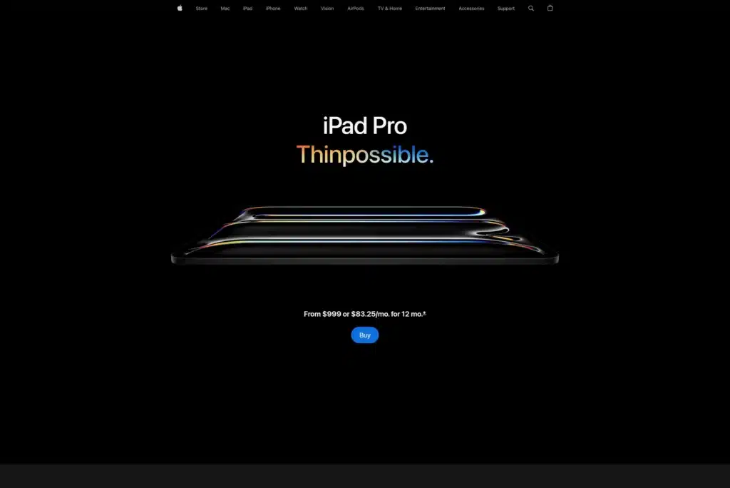
Apple’s brand identity is synonymous with simplicity, innovation, and premium quality. Let’s break down the elements that create this cohesive brand identity:
Logo:
Apple's minimalist logo, the iconic bitten apple, is simple yet instantly recognisable. It represents innovation and elegance, perfectly capturing the brand's core values.
Colour Palette:
Apple employs a clean and neutral color palette, predominantly using white, silver, and black. These brand colours convey a sense of sophistication and modernity, aligning with their high-quality product offerings.
Typography:
Apple's choice of typography, notably the San Francisco typeface, is clean, modern, and highly legible. This aligns with their emphasis on simplicity and usability.
Visual Style:
The visual style of Apple’s products and marketing materials is sleek, clean, and minimalist. From the design of their devices to their advertising, everything reflects a commitment to elegant simplicity.
Brand Messaging:
Apple’s marketing campaigns focus on the innovative features of their products. The messaging is straightforward, highlighting how their technology enhances users' lives without overwhelming them with technical jargon.
Voice and Tone:
Apple's voice is confident, clear, and sophisticated. Their tone is friendly yet authoritative, emphasising ease of use and innovation in a way that resonates with both tech enthusiasts and everyday users.
Empowerment and Performance

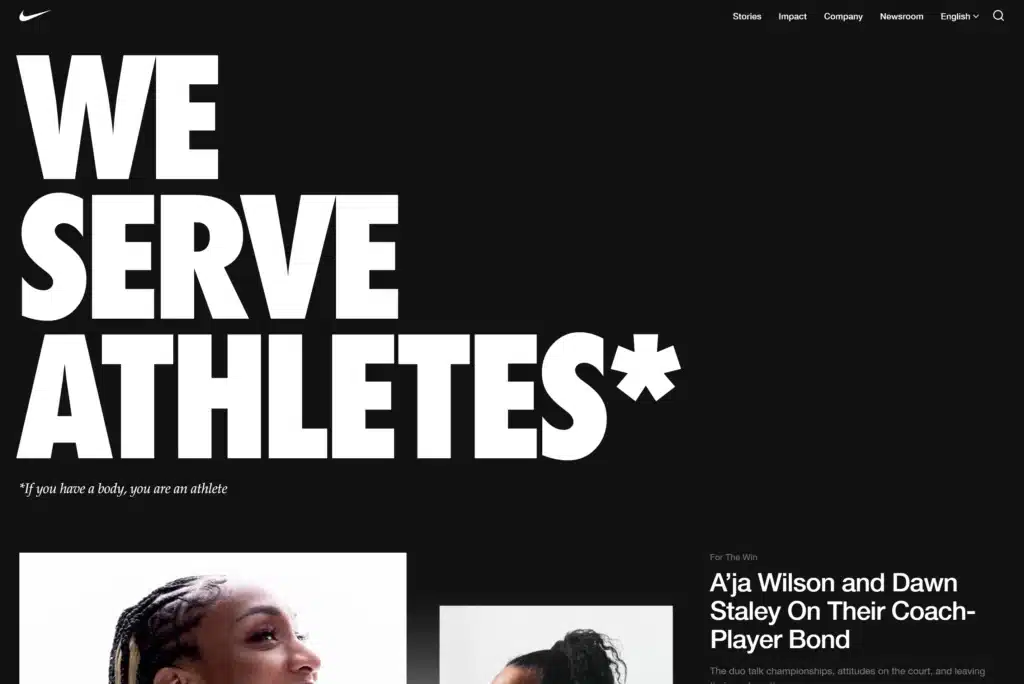
Nike’s brand identity is built around the concepts of empowerment and athletic performance. Let’s explore the components that shape this unified brand identity:
Logo:
Nike’s iconic swoosh logo is simple, dynamic, and instantly recognisable. It symbolises movement and speed, perfectly aligning with the brand's focus on athletic performance.
Colour Palette:
Nike primarily uses a bold colour palette, with black and white as foundational colours, often accented with vibrant hues like orange and neon green. This combination reflects energy, strength, and modernity.
Typography:
Nike uses bold, strong typography that conveys confidence and power. The fonts are clean and straightforward, complementing the brand’s clear and impactful messaging.
Visual Style:
The visual style in Nike's marketing and product design is bold and dynamic. High-contrast images, powerful action shots, and sleek product designs all emphasise athleticism and performance.
Brand Messaging:
Nike’s "Just Do It" tagline encapsulates the brand’s core message of motivation, perseverance, and empowerment. Their marketing campaigns often highlight personal achievement and overcoming obstacles, resonating deeply with their audience.
Voice and Tone:
Nike's voice is inspiring, confident, and motivational. Their tone is assertive yet inclusive, encouraging everyone, from elite athletes to everyday fitness enthusiasts, to push their limits and achieve their best.
Happiness and Tradition
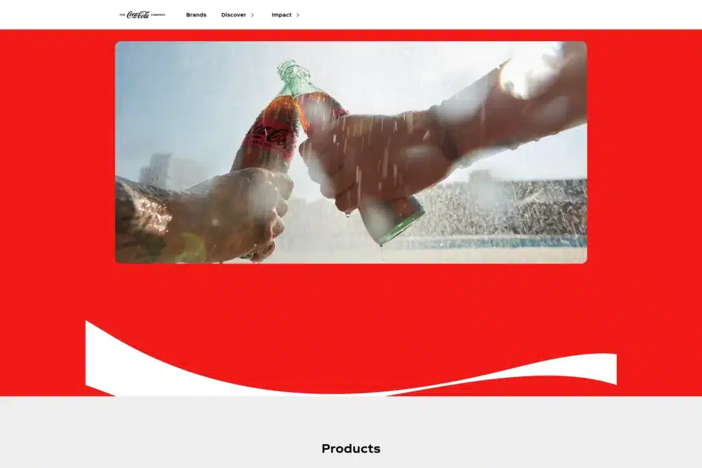
Coca-Cola’s brand identity revolves around happiness, togetherness, and tradition. Here are the key elements that form this consistent brand identity:
Logo:
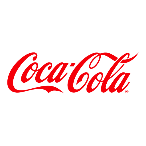
Coca-Cola’s timeless logo, with its distinctive Spencerian script, exudes a sense of nostalgia and familiarity. It is instantly recognisable and has remained largely unchanged since its inception, reinforcing the brand’s long-standing heritage.
Colour Palette:
The classic red and white colour scheme is synonymous with Coca-Cola. Red is a colour associated with excitement, energy, and passion, while white adds a sense of purity and simplicity, creating a vibrant and appealing visual identity.
Typography:
Coca-Cola’s use of the Spencerian script in its logo is elegant and traditional. This choice of typography evokes a sense of history and authenticity, aligning with the brand’s long-standing legacy.
Visual Style:
The visual style of Coca-Cola’s marketing materials often features nostalgic imagery and joyful scenes. This includes vintage ads, family gatherings, and festive celebrations, all of which highlight the brand’s association with happiness and togetherness.
Brand Messaging:
Coca-Cola’s marketing campaigns emphasise moments of joy, sharing, and celebration. Their messaging often centers around the idea of bringing people together, reinforcing the brand’s core values of happiness and tradition.
Voice and Tone:
Coca-Cola’s voice is warm, friendly, and inclusive. Their tone is cheerful and positive, celebrating life’s joyful moments and fostering a sense of connection and community.
Community and Experience

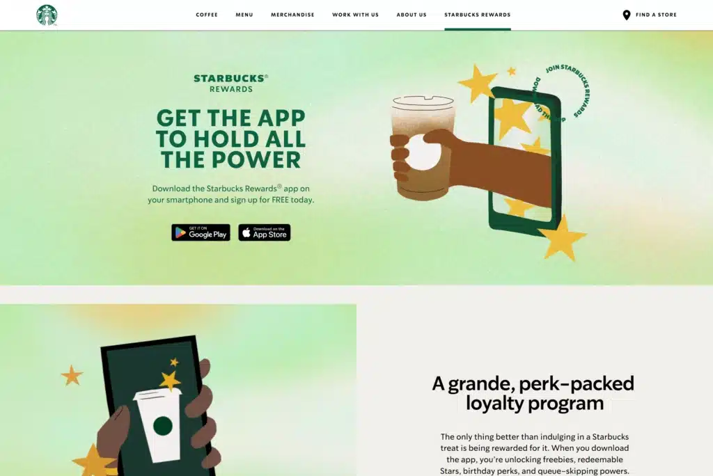
Starbucks has successfully created a brand identity centered around community, experience, and quality. We can identify the factors that make up this cohesive brand identity:
Logo:
The green mermaid logo is instantly recognisable and symbolises Starbucks' commitment to quality and its rich history. The mermaid, or siren, reflects a sense of mystery and allure, drawing customers into the Starbucks experience.
Colour Palette:
Starbucks uses a distinctive green and white colour palette, which conveys a sense of calm, relaxation, and nature. This aligns with their commitment to sustainability and ethical sourcing.
Typography:
Starbucks employs clean, modern typography that is both inviting and easy to read. Their choice of fonts reflects the brand’s approachable and friendly nature.
Visual Style:
The visual style in Starbucks' stores and marketing materials is warm, inviting, and cosy. Earthy tones, comfortable seating, and ambient lighting create a welcoming environment that encourages customers to linger and connect.
Brand Messaging:
Starbucks’ marketing highlights the unique experiences and personal connections that occur in their stores. Their messaging often focuses on the sense of community and belonging that Starbucks fosters, positioning them as a place to relax, work, and socialise.
Voice and Tone:
Starbucks’ voice is friendly, genuine, and inclusive. Their tone is warm and welcoming, emphasising personalised customer service and a commitment to creating a positive and memorable experience for every customer.
Innovation and Sustainability


Tesla’s approach has made it a leader in electric vehicles and a symbol of future transportation. It appeals to consumers who value sustainability and innovative products.
Logo:
Tesla’s sleek, modern logo features a stylized "T" that represents both the company name and the cross-section of an electric motor. It reflects the brand’s focus on advanced technology and innovation.
Colour Palette:
Tesla uses a clean and sophisticated colour palette, primarily consisting of red, black, and white. These colours convey a sense of modernity, power, and precision, aligning with their cutting-edge products.
Typography:
Tesla employs sleek, modern typography that is both futuristic and highly legible. This choice of fonts underscores the brand’s emphasis on forward-thinking technology and innovation.
Visual Style:
The visual style in Tesla's marketing and product design is minimalistic and cutting-edge. Sleek lines, high-quality materials, and futuristic aesthetics are prevalent in their vehicle designs and promotional materials.
Brand Messaging:
Tesla’s marketing emphasises their advanced technology, environmental benefits, and the future of transportation. Their messaging focuses on the innovation and sustainability aspects of their electric vehicles, appealing to eco-conscious and tech-savvy consumers.
Voice and Tone:
Tesla’s voice is confident, visionary, and aspirational. Their tone is assertive yet inspiring, reflecting their mission to accelerate the world’s transition to sustainable energy and positioning themselves as pioneers in the automotive industry.
This consistent approach has positioned Tesla as a leader in the electric vehicle market and a symbol of the future of transportation, appealing to consumers who value sustainable practices and innovative products.
Wellness and Lifestyle

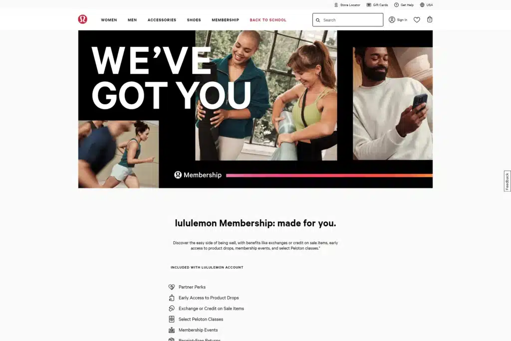
Lululemon’s brand identity focuses on wellness, mindfulness, and an active lifestyle. Here’s a breakdown of the features that contribute to this strong brand identity:
Logo:
Lululemon’s logo is a stylised "A" shaped symbol that resembles an omega or a yoga pose, representing balance and well-being. It is distinctive and easily recognisable, reflecting their commitment to fitness and wellness.
Colour Palette:
Lululemon employs a calming and sophisticated colour palette, often incorporating shades of red, white, and black. These colours evoke a sense of energy, strength, and simplicity, aligning with their focus on wellness and mindfulness.
Typography:
Lululemon uses clean, contemporary typography that is both stylish and easy to read. Their choice of fonts reflects their modern approach to lifestyle and fitness.
Visual Style:
The visual style in Lululemon’s branding and marketing materials is serene and motivational. They often feature serene imagery, active lifestyles, and inspirational messages that resonate with their target audience.
Brand Messaging:
Lululemon’s marketing campaigns emphasise the benefits of an active lifestyle and mindfulness. They often use real-life testimonials and community stories to connect with their audience, showcasing how their products support a healthy and balanced lifestyle.
Voice and Tone:
Lululemon’s voice is supportive, motivational, and aspirational. Their tone is encouraging yet grounded, reflecting their commitment to helping individuals achieve their wellness goals and live a balanced life.
Affordability and Design
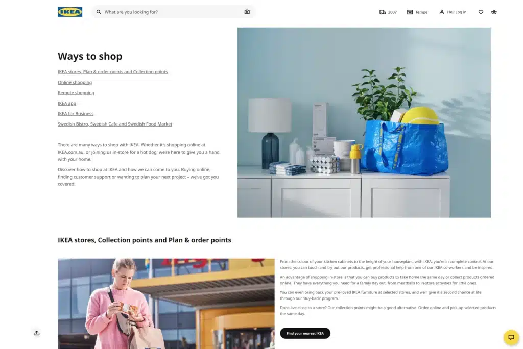
IKEA’s brand identity is built around affordability, functionality, and Scandinavian design. Let’s delve into the parts that build this integrated brand identity:
Logo:
IKEA’s blue and yellow logo is instantly recognisable and reflects the brand's Swedish heritage. The bold and simple design conveys reliability and trustworthiness.
Colour Palette:
The use of blue and yellow in IKEA’s branding is not only a nod to the Swedish flag but also evokes feelings of trust, optimism, and friendliness. These colours help make the brand approachable and welcoming.
Typography:
IKEA uses straightforward, modern typography that is easy to read. Their fonts are clean and functional, aligning with their emphasis on practicality and simplicity.
Visual Style:
The visual style in IKEA’s marketing and store design is clean, functional, and inspirational. Store setups and product displays are designed to inspire customers, showcasing how products can be used in real-life settings with a focus on functionality and style.
Brand Messaging:
IKEA’s marketing emphasises the practicality, affordability, and stylishness of their products. Their messaging focuses on providing smart solutions for everyday living, appealing to budget-conscious consumers who still want well-designed furniture.
Voice and Tone:
IKEA’s voice is friendly, straightforward, and practical. Their tone is approachable and helpful, often providing tips and ideas for home improvement and efficient living.
Crafting Your Own Brand Identity
Establishing a strong brand identity is essential for standing out in a competitive market. Studying successful brands like Apple, Nike, Coca-Cola, Starbucks, Tesla, Lululemon, and IKEA can provide valuable insights into crafting a cohesive and memorable brand identity for your business.
However, building a powerful brand identity can be challenging. It requires a deep understanding of your target audience, a clear articulation of your brand values, and a strategic approach to design and communication. This is where professional agencies like Spark can make a significant difference. We specialise in branding and developing unique, effective brand identities that differentiate you from competitors and foster long-term customer loyalty.
Ready to take your brand to the next level? Contact us today to start building a brand identity that truly resonates with your audience. As a leading Sydney branding agency, we specialize in creating compelling and effective branding strategies that set you apart from the competition.