Designing a premium, white label hand protection brand
Hand protection isn’t glamorous. When you need a durable glove, it’s because the job is dirty and dangerous. But for Impro Limited, a white label glove provider, they wanted to show that there is still elegance and style behind the design of commercial hand protection. They wanted to be the Apple of glove manufacturing.
The challenge? As a new company, Impro would need to create this premium feel with limited assets or product photography, as well as a budget that was a fraction of what sleek, luxury brands like Apple usually devote to developing their visual style. All Impro had was a name and a vision.
Capturing the kind of user experience they wanted would require a strategic application of their brand and web design.
Client Objectives: Professional Quality on a Practical Budget
From our initial consultation, three key priorities emerged: Create a premium experience without premium assets. No product photography, no fancy photoshoots—just smart design that instantly communicates quality.
Build a responsive, animated website. The client wanted subtle animations and a fluid user experience that worked across all devices, echoing the smooth, intuitive user journey of the major tech brands. Target a specific audience niche. The brand and website would primarily target US and Canadian audiences.
That meant it would need to stand out from the big, international players that had a grip in these markets.
Meet an ambitious timeline. The entire project—branding, digital stationery, and website—needed to be completed in just a few months. With a time crunch to establish a professional brand and get a polished site up and running, the project could best be summed up as doing the best with the least.
Design Strategy: Simple elements that make a big impact
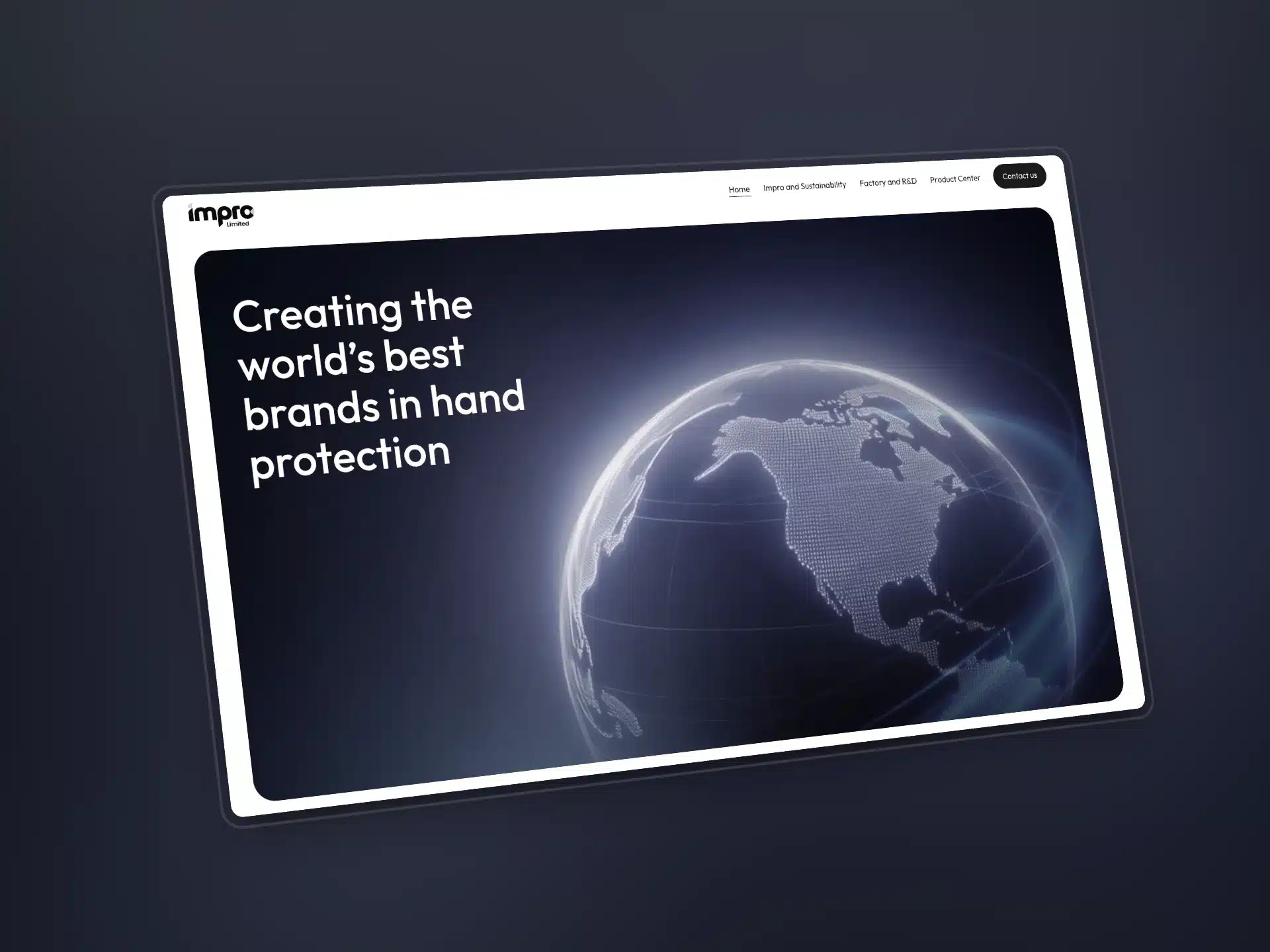
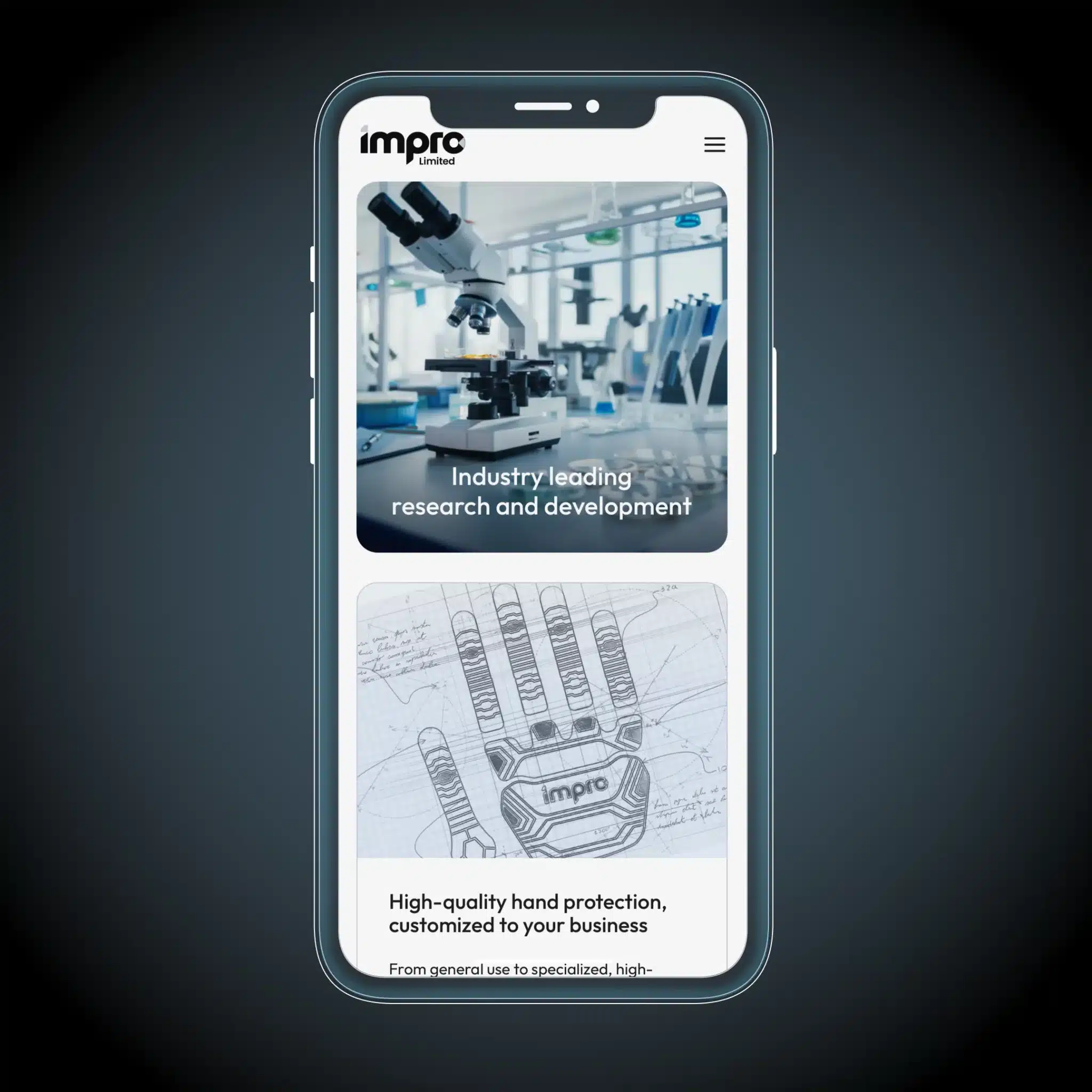
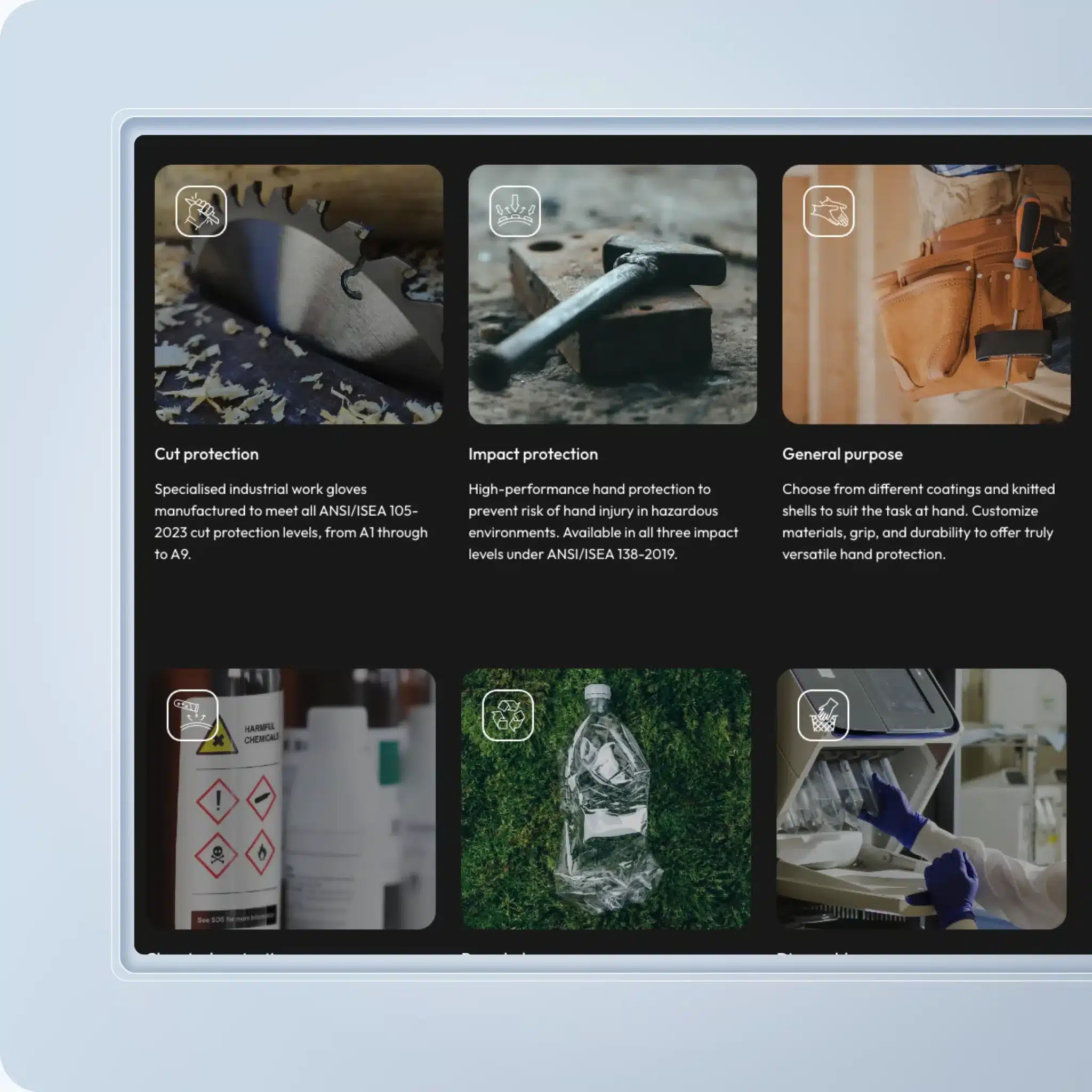
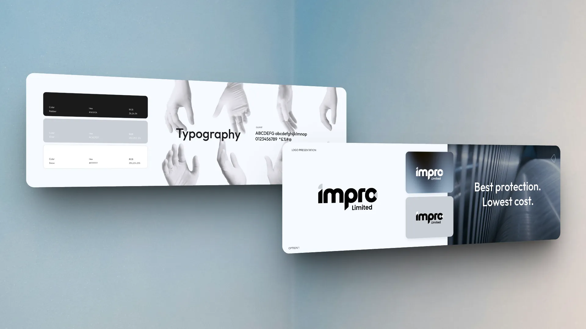
Brand Development: Texture Over Product
How do you create compelling visuals for a product you can’t show? We knew this was going to be the biggest challenge going into the Impro brand development project. We weren’t going to have product photography by the project deadline.
So, instead, we made an early decision to focus on texture and materials, rather than the hand protection products themselves. The point was to suggest technical sophistication without spelling it out.
To this, the team developed a black and silver colour palette with subtle gradient textures, bringing out a bit of class in the close-cropped industrial imagery used.“No matter what it’s paired with–video, photo, or text–the brand makes it feel clean and deliberate,” noted Ben, Content Strategist for the project.
“It could be a picture of a brick on a workshop floor, but the design makes it feel intentional.”This approach allowed the team to use manufacturing footage and other more abstract assets in a way that felt integrated and wholly part of the final website design.
Clean, precise typography became the backbone of the visual system. Not only did this lend well to a minimalist style, but it also made it quick to iterate on new designs.
The team refined a minimal typographic approach that felt technical without being cold.
Emphasis was put on the little things–the spacing between sections, the proportions between headings and images. This highly-focused finetuning is often what gives premium brands their distinctive feel.
What emerged for Impro was a visual language that felt at home alongside high-end consumer products, clearly carving out an identity for itself within the hand protection niche.
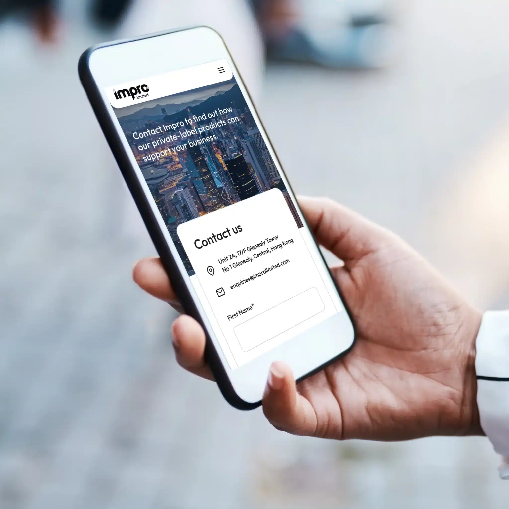
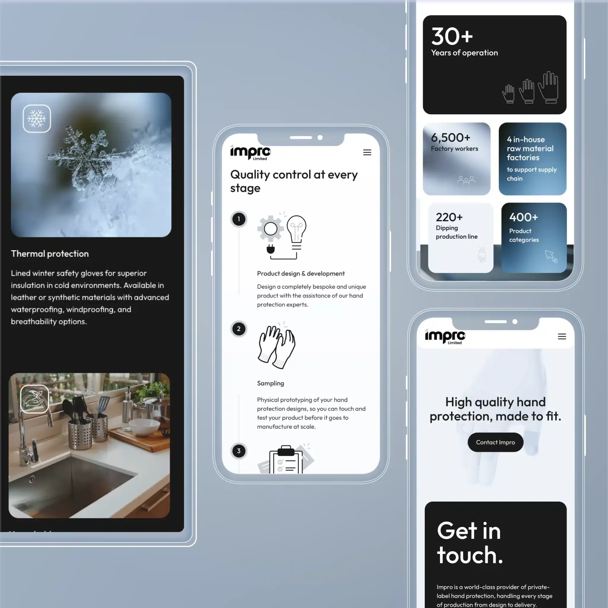
Responsive Design & Technical Implementation
The Two-Week Sprint
The website implementation presented particular challenges given the compressed timeline.
Development lead Ha-Ram had to ensure flawless performance across browsers while maintaining the sleek animations that gave the site its premium feel.“At all times, we were testing on mobile and desktop across Safari, Edge, Chrome…” Ha-Ram explained.
“But our goal was to create a single, responsive design. Something that could scale up and down across devices while maintaining the proportions we wanted.”This approach paid off during the final two-week sprint to get the website live.
After the initial set-up of the front-end, client feedback was able to be implemented rapidly with changes cascading across all versions of the site–desktop, mobile, and tablet.
The team implemented several technical solutions, including video optimisation.
To keep the site loading fast, we optimised all in-page video, taking video files around 60 megabytes in size and reducing them to below 10. Responsive text scaling. Text elements were programmed to scale proportionally with screen size, maintaining perfect spacing regardless of device. Subtle animations. Clean transitions between sections created a sense of fluid movement without complicating the design.
Team Reflections
The client’s reaction mirrored the team’s enthusiasm. After weeks of back-and-forth on specific design elements, seeing the final execution brought immediate approval and appreciation for how perfectly the vision had been realised.
“I was really happy with how modern and clean it looks, not just in design but in the build as well. It’s great to look at, the animations are smooth, it included all the functionalities the client needed, and it was built fast within a small budget.”
Chau, Interaction Designer
“It’s clean, but it’s fluid. The layout feels really solid. You can tell everything fits in the right place, even as you move across screen sizes. Nothing is going to suddenly break or cause any ugly visual errors.”
Kath, Creative Director
“For the website, every page looks great. It’s a straightforward style, but the overall effect is really impactful. The colours, imagery, and animations all add a little bit to each other, making the whole stand out that much more.”
Ben, Content Strategist
Why This Project Matters for Industrial Brands
Companies providing rugged, industrial solutions often fall into predictable design patterns—heavy blues, industrial yellows, and uninspired messaging. Impro Limited demonstrates how breaking those conventions can create powerful differentiation in markets where most brands look remarkably similar.
Most importantly, this project proves that a premium experience doesn’t always require premium budgets. With some smart design thinking and strategic visual choices, you can zero in on a few key elements of a visual style to create the exact experience you want for your customers.
Ready to break the mould with your brand? Contact Spark Interact today to discuss how we can elevate your digital presence.