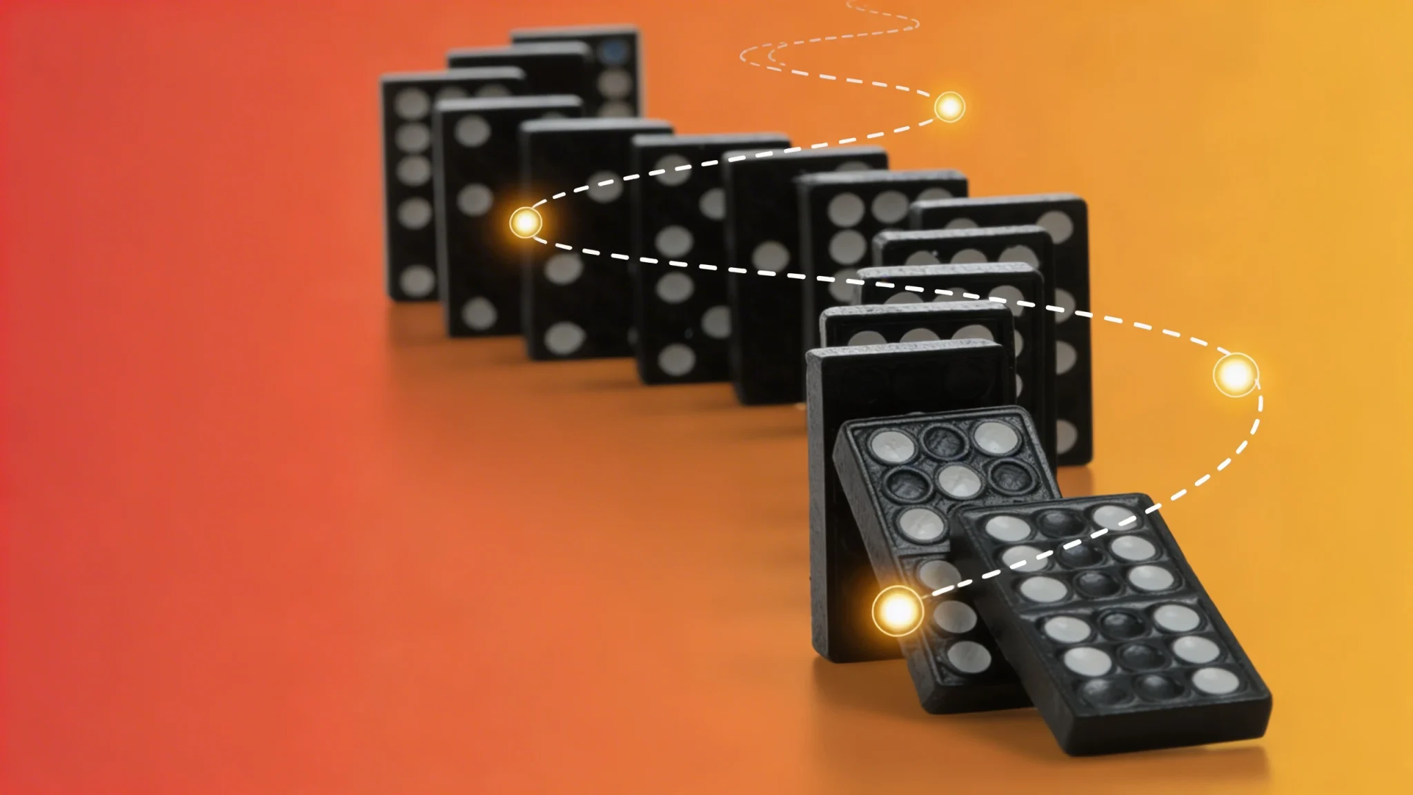
I’ve lost count of how many times I’ve opened a client’s brand guidelines to find Montserrat cheerfully assigned as both the heading and body font. And look, I get it. Montserrat is gorgeous. It’s clean, it’s modern, it’s got that geometric elegance that makes everything feel instantly more sophisticated. There’s a reason it’s one of the most popular Google Fonts out there.
But here’s the thing: just because a font looks beautiful doesn’t mean it works for everything. And Montserrat? It’s a terrible choice for body text.
The Geometric Trap
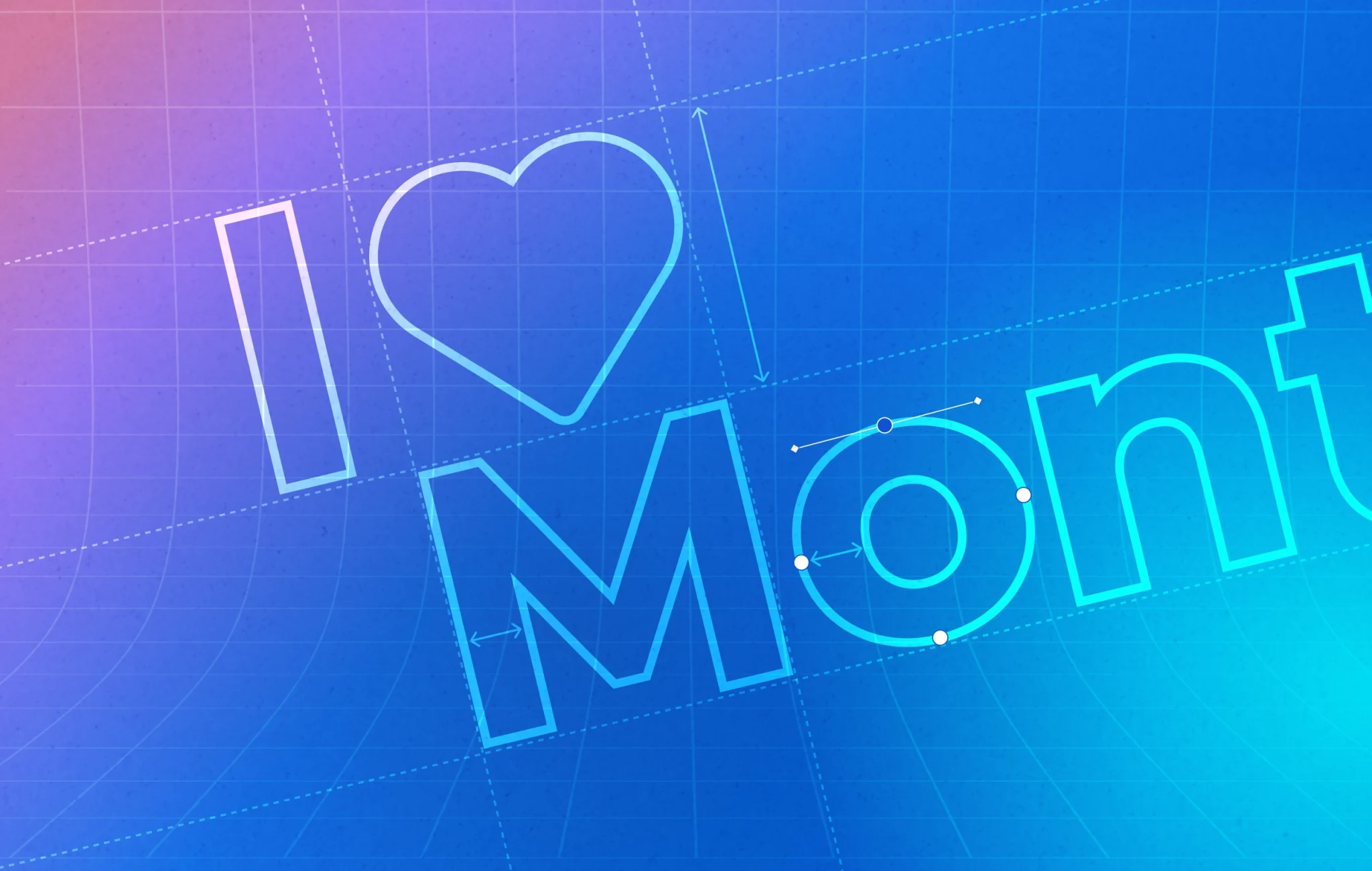
Montserrat was designed with geometric precision in mind. Those perfect circles, those uniform stroke widths, that lovely consistency across letterforms—it’s all part of what makes it so appealing for display use. When you’re setting a headline or a pull quote, that geometric quality creates impact. It commands attention.
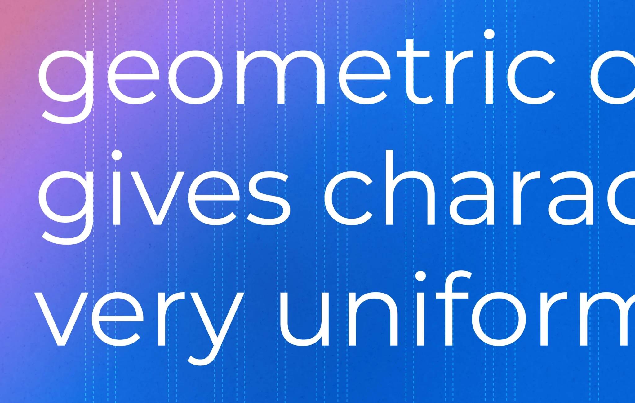
But when you’re reading paragraph after paragraph of text, those same qualities become a liability. Your eye needs variation to move comfortably through copy. Natural typefaces—the ones that evolved from hand-drawn letterforms—have subtle irregularities in character width, stroke weight, and spacing. Those “imperfections” aren’t bugs; they’re features. They create a rhythm that makes reading feel effortless.
Montserrat’s geometric uniformity does the opposite. Everything is so perfectly consistent that your eye has fewer anchoring points as it moves across the line. Reading becomes work instead of flow.
The Expansion Problem
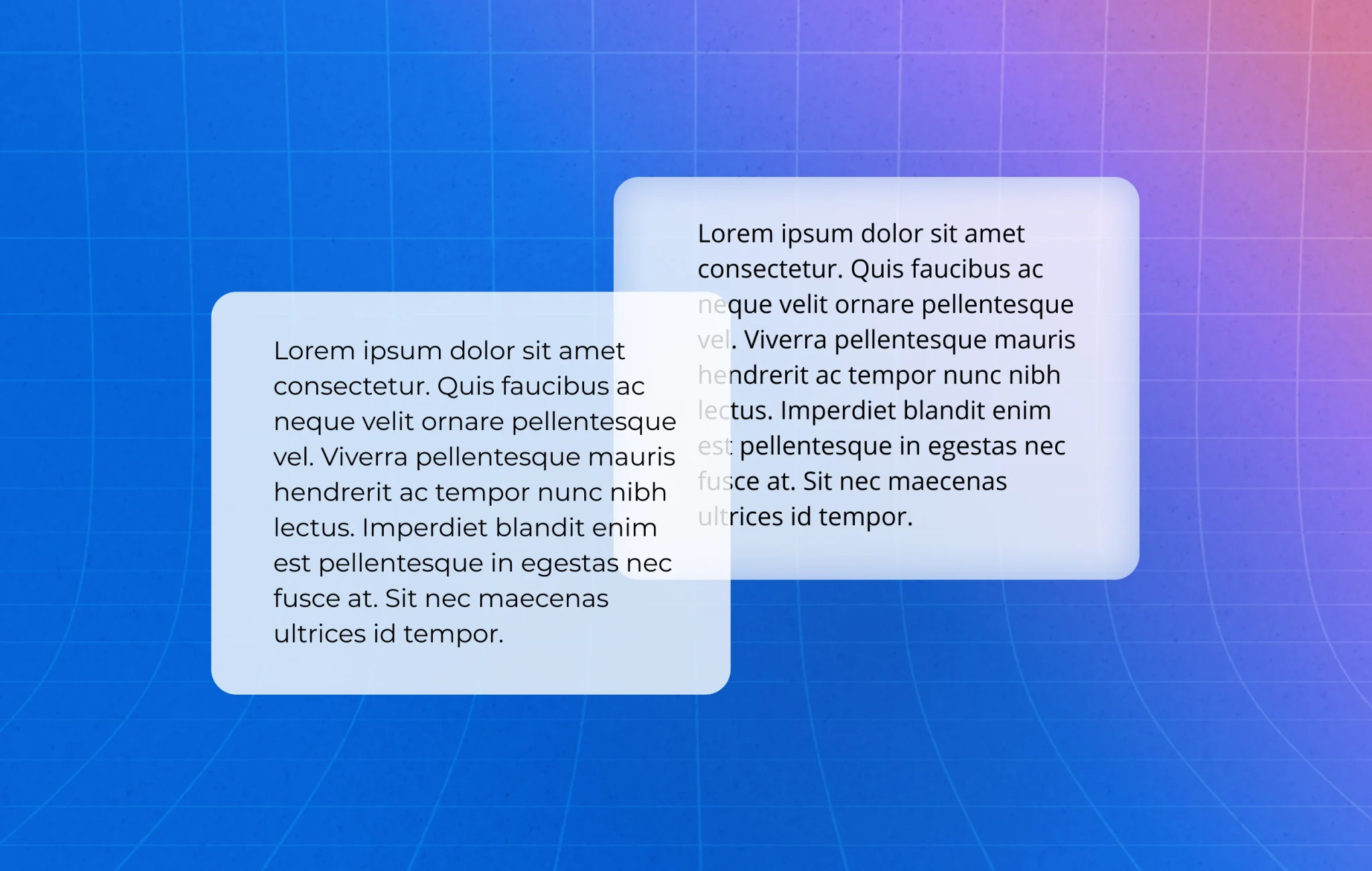
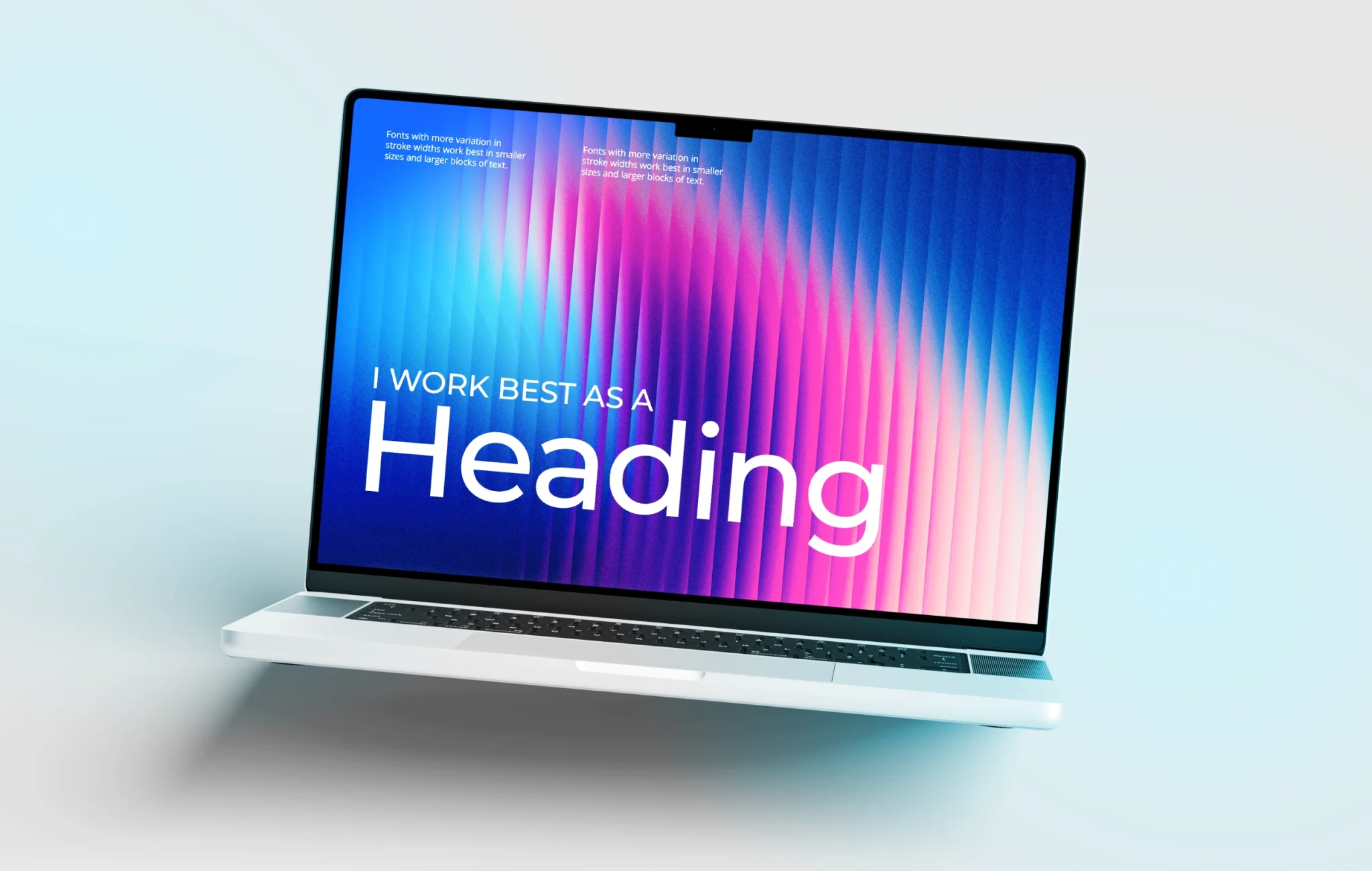
There’s another issue with Montserrat that doesn’t get talked about enough: it’s slightly expanded. Each character takes up just a bit more horizontal space than you’d expect, which means you get fewer characters per line at any given size.
This matters more than you might think. Optimal line length for readability sits somewhere between 50-75 characters. When you’re using an expanded font like Montserrat for body text, you either end up with uncomfortably short lines (which makes reading feel choppy) or you have to increase your column width (which makes lines too long and causes readers to lose their place when returning to the next line).
It’s a lose-lose situation.
Visual Fatigue Is Real
Here’s what happens when someone tries to read three or four paragraphs of Montserrat body text: their eyes start working overtime. All those perfect geometric shapes, all that consistent weight, all that uniformity—it creates what designers call “visual fatigue.”
Your brain is constantly scanning text for patterns and distinctions to aid comprehension. When everything looks too similar, your brain has to work harder to distinguish between letters and words. After a few paragraphs, readers might not even consciously realise they’re tired, but they’ll start skimming instead of reading. They’ll lose focus. They’ll click away.
This isn’t theoretical. I’ve seen it happen with client websites. Beautiful Montserrat body text that looks stunning in the mockup but performs terribly once real users try to engage with the content.
Where Montserrat Actually Shines
None of this means Montserrat is a bad font. It’s a brilliant font—when used appropriately.
All-cap headings? Perfect. Those geometric forms create strong hierarchy and that expanded quality gives headings breathing room. Large numbers or statistics in infographics? Excellent choice. The uniformity makes figures easy to scan quickly. Navigation menus, labels, short bursts of text? Absolutely.
Montserrat thrives in display contexts where you’re meant to see the text, not disappear into reading it. That’s not a criticism—that’s just understanding what the font was designed to do.
What to Use Instead
If you love Montserrat’s aesthetic for your headings (and honestly, who could blame you?), pair it with a proper text font for your body copy. Look for something with:
• Slight variations in stroke weight (humanist characteristics)
• Natural character width variations
• Clear distinction between similar characters (like I, l, and 1)
• Generous x-height for better readability at smaller sizes
Fonts like Lora, Merriweather, or Source Sans Pro pair beautifully with Montserrat while actually being designed for extended reading. Your headings get that clean, modern impact, and your body text becomes invisible in the best possible way—readers focus on your message instead of fighting with the typography.
The Bottom Line
Typography isn’t just about aesthetics. It’s about communication. The prettiest font in the world is useless if people can’t comfortably read what you’re trying to say.
Montserrat is a stunning display font. Use it for headings, use it for callouts, use it for those moments where you want visual impact. But please, please give your readers’ eyes a break and choose something designed for body text when it comes to your paragraphs.
Your content deserves to be read, not just admired from a distance.
Have questions about typography or brand design? We love talking about this stuff. Get in touch and let’s make sure your fonts are working as hard as your content.