Picture this: A client wraps up their project with us, everything’s looking brilliant, and then they hit us with this pearler: “Why would I pay for brand guidelines when I can just ring you up and ask what font we use?”
Record scratch. Freeze frame.
Yep, that’s us, having a bit of an existential crisis about how to explain why knowing your exact shade of blue actually matters. But here’s the thing — this client wasn’t wrong. They were just at a different spot on the business journey than they realised.
When David Dreams of Being Goliath
When you’re moving up in the construction industry with your eye on the big players – Multiplex, Lendlease, to name a couple – think about this:
Every single one of those construction giants has brand guidelines thicker than a Sydney phone book (remember those?).
Our Creative Director put it brilliantly: “Walk past any Lendlease site. Everything matches perfectly — from the hard hats to the hoardings. That’s not because their CEO is WhatsApping the design team asking ‘Is it teal or turquoise?'”
The penny started to drop. Those big players aren’t accidentally consistent. They’re intentionally, obsessively, almost religiously consistent. And that’s partly how they got big in the first place.
The “She’ll Be Right” Approach (Spoiler: She Won’t Be)
Right now, if you’re running the whole show yourself, your brand probably looks pretty schmick. You commissioned that capability statement, you approved the website, you’re across everything. You’re the brand guardian, the keeper of the colours, the font whisperer.
But then growth happens. Suddenly you’ve got Sarah in admin creating PowerPoints, Tom the new marketing bloke designing social posts, and some random signwriter in Western Sydney interpreting your logo in ways that would make you weep into your flat white.
We’ve seen this film before, and it’s more horror than comedy. One aviation client came to us with what can only be described as a “brand buffet” — a little bit of this font here, a splash of that colour there, and somehow their logo had mysteriously gained a drop shadow that nobody could explain.
“The stuff you create looks ace,” one client told us, with a mix of frustration and resignation. “But when my team tries to make something, it’s like they’re playing pin the tail on the donkey. Blindfolded. After a few drinks. And I don’t know how to tell them what’s wrong because I don’t speak design.”
Your Brand Guidelines: Part Instruction Manual, Part Love Letter
Let’s bust a myth: Brand guidelines aren’t just a fancy PDF that lists your colours like some sort of corporate paint chart. When we create them, we’re basically writing the autobiography of your brand’s visual personality.
Sure, we include the nerdy stuff — your Pantone 287C (not just “blue”, thank you very much), your primary typeface (Helvetica Neue, not Arial, and definitely not Comic Sans). But we go deeper than a paint-by-numbers kit.
We explain the why behind the what. Why that particular blue says “trustworthy” in your industry while a different blue screams “trying too hard.” Why your clean, modern font suggests innovation while Times New Roman would make you look like you’re stuck in 1995. We even include what we call the “please don’t do this” section — a gentle guide to preventing your logo from suffering indignities like being stretched, squashed, or given a rainbow gradient by an enthusiastic intern.
Think of it as your brand’s instruction manual meets its love letter meets its protective parent all rolled into one.
The Customer Pyramid of Needs (Or: Where Are You on the Mountain?)
Here’s some real talk: Not everyone needs comprehensive brand guidelines. If you’re a one-person show who’s happy flying solo, extensive guidelines might be like buying a ride-on mower for a courtyard garden. Bit much.
We use something called the Customer Pyramid of Needs to help businesses understand where they sit. Think of it like Maslow’s hierarchy, but for your marketing journey. At the base, you’ve got “Need to Establish” — that’s your brand identity, logo, the foundational stuff. It’s where brand guidelines live, right there in the basement, holding everything else up.
You’re ready to solidify those foundations with brand guidelines if you’ve ever:
- Received marketing materials that made you think “What fresh hell is this?”
- Spent 20 minutes explaining to a supplier that “greenish-blue” isn’t quite right
- Had your logo come back from the printer looking like it went through a funhouse mirror
- Found yourself saying “No, not that font, the other one… no, the OTHER other one”
- Dreamed of having minions (staff) but feared what they might do unsupervised
You can probably wait if:
- You’re still figuring out if your business name is staying
- Your entire marketing budget is three Instagram posts and hope
- You personally oversee every pixel that represents your brand
- Your biggest design decision is which email signature to use
The beauty of the pyramid is that it shows how everything builds on everything else. You can’t reach “Need for Affirmation” at the top (thought leadership, being the industry voice) if your foundation’s wonky. It’s like trying to be a food influencer when you can’t boil water.
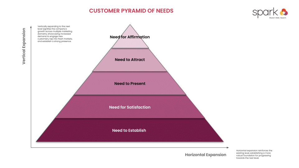
Discover more about our Customer Pyramid of Needs frameworks.
Building Your Business Pyramid (The Ancient Egyptian Way, Not the Dodgy MLM Way)
Our Customer Pyramid of Needs shows exactly where brand guidelines fit in your business journey. Right at the bottom, in “Need to Establish” — the foundation level. Not the sexy stuff up top like thought leadership and viral campaigns, but the bedrock that stops everything from turning into a very expensive pile of rubble.
Here’s the thing: You can’t skip levels. You can’t jump from having a logo sketched on a napkin straight to “Need for Affirmation” at the top. Well, you can try, but it’s like putting a penthouse on quicksand. Looks great for about five minutes, then… not so much.
One client understood immediately when we showed them the pyramid: “So you’re saying my capability statement and website are sitting on level two — ‘Need for Satisfaction’ — but without proper brand foundations underneath, they’re basically floating?”
Bingo. And floating things tend to drift. In different directions. Which is how you end up with that “brand buffet” situation we mentioned earlier.
The Plot Twist: We Don’t Always Push the Sale
Here’s something that might surprise you: Sometimes we tell clients they’re not ready for brand guidelines. Gasp! A marketing agency turning down money?
But here’s our thinking: Pushing brand guidelines on a business that isn’t ready is like selling a teenager a pension plan. Sure, it’s probably a good idea eventually, but right now they’ve got other priorities (and let’s be honest, they’re not listening anyway).
Instead, we plant seeds. “You don’t need this today,” we’ll say, “but remember us when you’re drowning in inconsistent marketing materials and your logo has somehow developed three different versions that are all ‘official’.”
We’ve found it’s often the strategic thinker in the partnership who gets it first. While one partner’s calculating immediate ROI, the other’s imagining their company logo on the side of a building, done right, looking magnificent. They get that consistency isn’t about being boring — it’s about being memorable.
The “Aha!” Moment
The lightbulb moment usually comes about six months later. It’s typically triggered by what we call a “brand incident” — maybe their biggest competitor just rebranded and looks incredibly professional, or they’ve pitched to a major client who asked about their brand standards, or they’ve received their fifth “creative interpretation” of their logo from well-meaning suppliers.
Suddenly, they understand. Brand guidelines aren’t about control-freaking over colours. They’re about:
- Empowering your team to make decisions without you
- Looking like the professional operation you actually are
- Saving time (and sanity) on endless design discussions
- Building recognition in your market
- Actually sleeping at night knowing your brand isn’t being massacred
The Bottom Line (In Your Correct Brand Font, Of Course)
Look, we get it. When you’re hustling to grow your business, brand guidelines can feel about as essential as a chocolate teapot. But here’s the thing: Every business that you admire, every company you aspire to compete with, they all figured this out. Not because they’re design nerds (well, some are), but because they realised that looking professional consistently isn’t a luxury — it’s a business strategy.
Whether you’re ready to take the plunge or you’re still in the “she’ll be right” phase, just remember: Your brand is being built right now, today, with every email, every invoice, every interaction. The only question is whether you’re building it on purpose or by accident.
And if you’re still not convinced, just remember this: Somewhere out there is a signwriter who thinks your logo would look “sick” with a drop shadow and a gradient. Without brand guidelines, you’re powerless to stop them.
Sweet dreams.
At Spark Interact, we work with businesses wherever they are on their brand journey — from “what’s a Pantone?” to “our brand guidelines need guidelines.” Whether you need the full monty or just a gentle nudge in the right direction, we’re here to help you build a brand that doesn’t make you cringe when you see it in the wild.