When Nathan first approached Spark Interact, he was running Chowzaco, a company supplying mining goods and equipment. He needed something straightforward — a six-page capability statement and perhaps some branding work to better represent his existing business. It was a clear brief, the kind of project that follows a familiar path. But then life intervened, and what started as a standard branding exercise evolved into something far more significant.
After an injury that required surgery and an extended recovery period, Nathan found himself with something rare in the mining industry: time to think. During that recovery, a conversation with a mate about developing a biodegradable alternative to traditional timber supports sparked an idea. By the time Nathan returned to Spark, he had a completely different project in mind — and a tight deadline to match.
“We need to get a logo done really quickly because we want to put it onto the mould for when they make the prototypes,” Nathan explained. He’d developed BlickBlock, a stackable interlocking block designed to replace timber supports in underground mining operations. The product was lightweight, sustainable, and significantly stronger than its timber equivalent. But it needed an identity — and it needed it fast.
Building the Brand Foundation
The clock was ticking. Nathan needed a logo that could be moulded directly into the prototype blocks, which meant it had to be simple, clean, and producible without gradients or complex details. But it also needed to represent the innovation and structural integrity of the product itself.
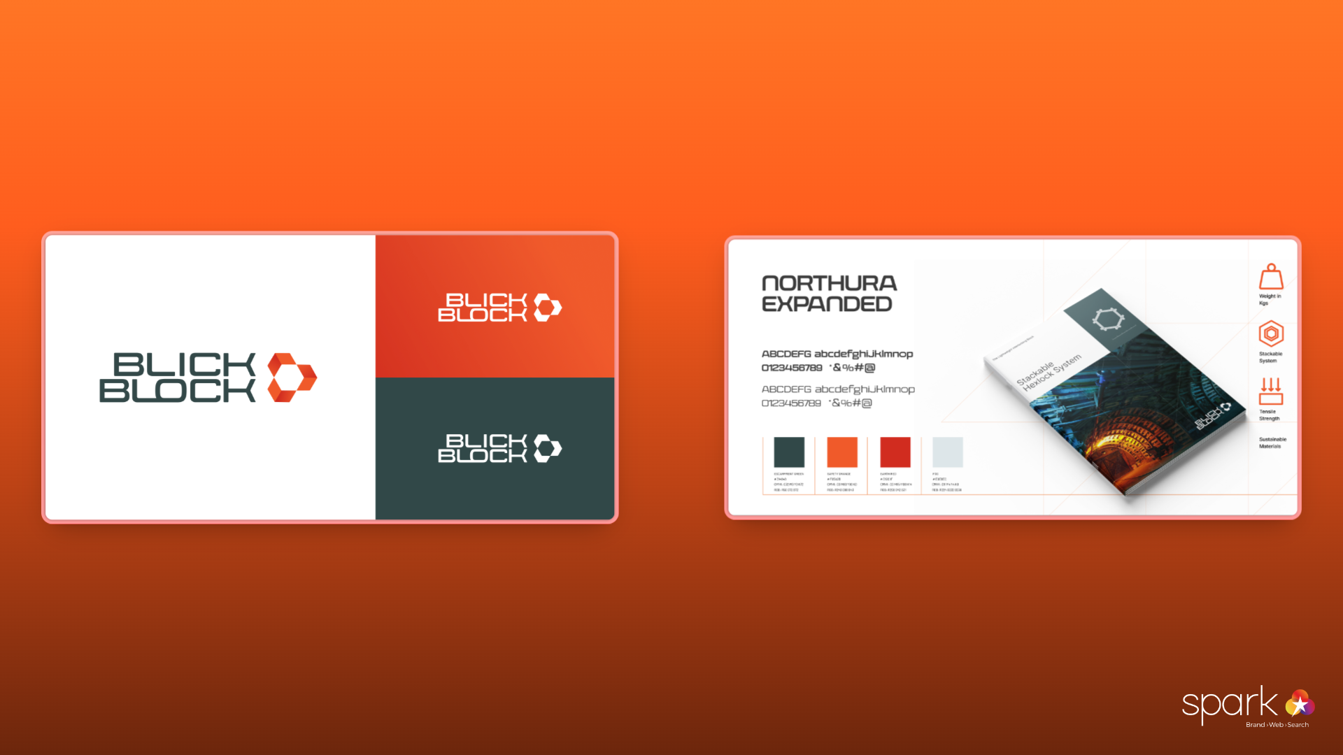
Kath, Spark’s Creative Director, saw the opportunity immediately. The hexagon shape wasn’t just aesthetically pleasing — it was fundamental to how BlickBlock worked. The product featured a honeycomb hexagonal structure within each block, providing lightweight strength, and the blocks themselves locked together in a hexagonal formation.
“The honeycomb feature of the product was unique and helped to form the basis of the identity. We wanted to create a symbol that could not only be represented clearly in one colour, but was instantly recognisable. The hexagon shape was integral both the individual product pieces and its stacked formation.”
Kath, Creative Director
The team selected a typeface that mirrored the geometric precision of the hexagons, creating visual cohesion between the logo and the product. The distinctive orange colour of the blocks themselves became a key brand element, establishing immediate recognition between the visual identity and the physical product.
“We wanted to create something that could be easily branded onto the product surface,” Kath explained. “It had to be really crisp.” The result was a logo that worked as both a brand mark and a functional moulding element — simple enough for manufacturing requirements, sophisticated enough to represent a genuine innovation in mining technology.
With the logo approved and sent off for moulding, Nathan disappeared into the development process. It would be some time before he returned.
Creating the First Touchpoint
When Nathan came back to Spark, he had working prototypes and something even more valuable — data. BlickBlock had undergone rigorous testing at Western Sydney University, and the results exceeded expectations. The blocks could withstand nearly 900 tonnes of pressure when stacked, vastly outperforming traditional timber supports whilst weighing only a fraction of the equivalent.
Now Nathan needed to communicate this to potential clients. The challenge was translating technical performance into a compelling business case for an industry that had relied on timber supports for decades.
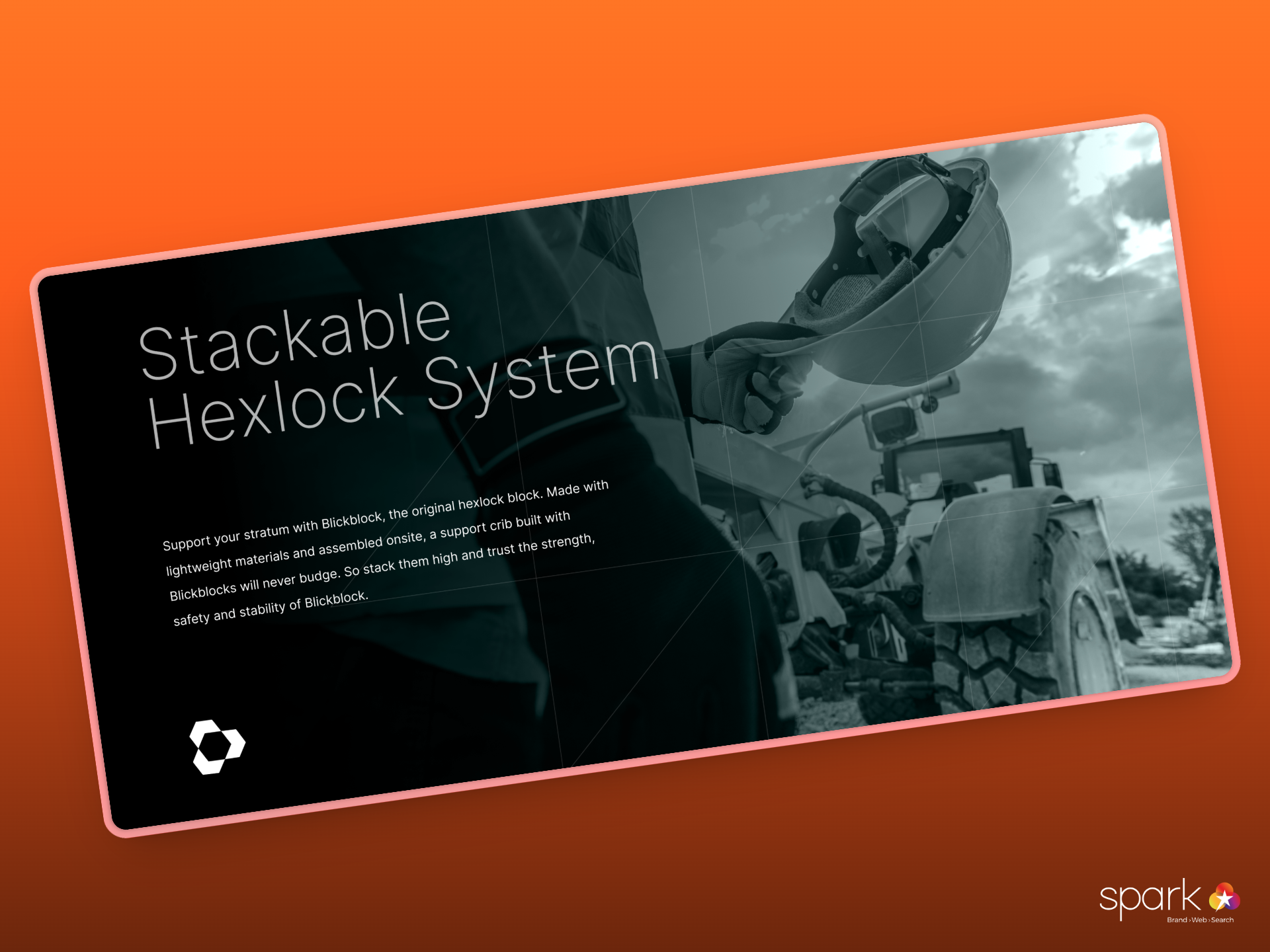
The team developed a six-page capability statement that balanced technical specifications with practical benefits. The document needed to speak to mine site managers who understood the day-to-day frustrations of timber supports — the inconsistent quality, the shrinkage over time, the splinters, the weight, the waste.
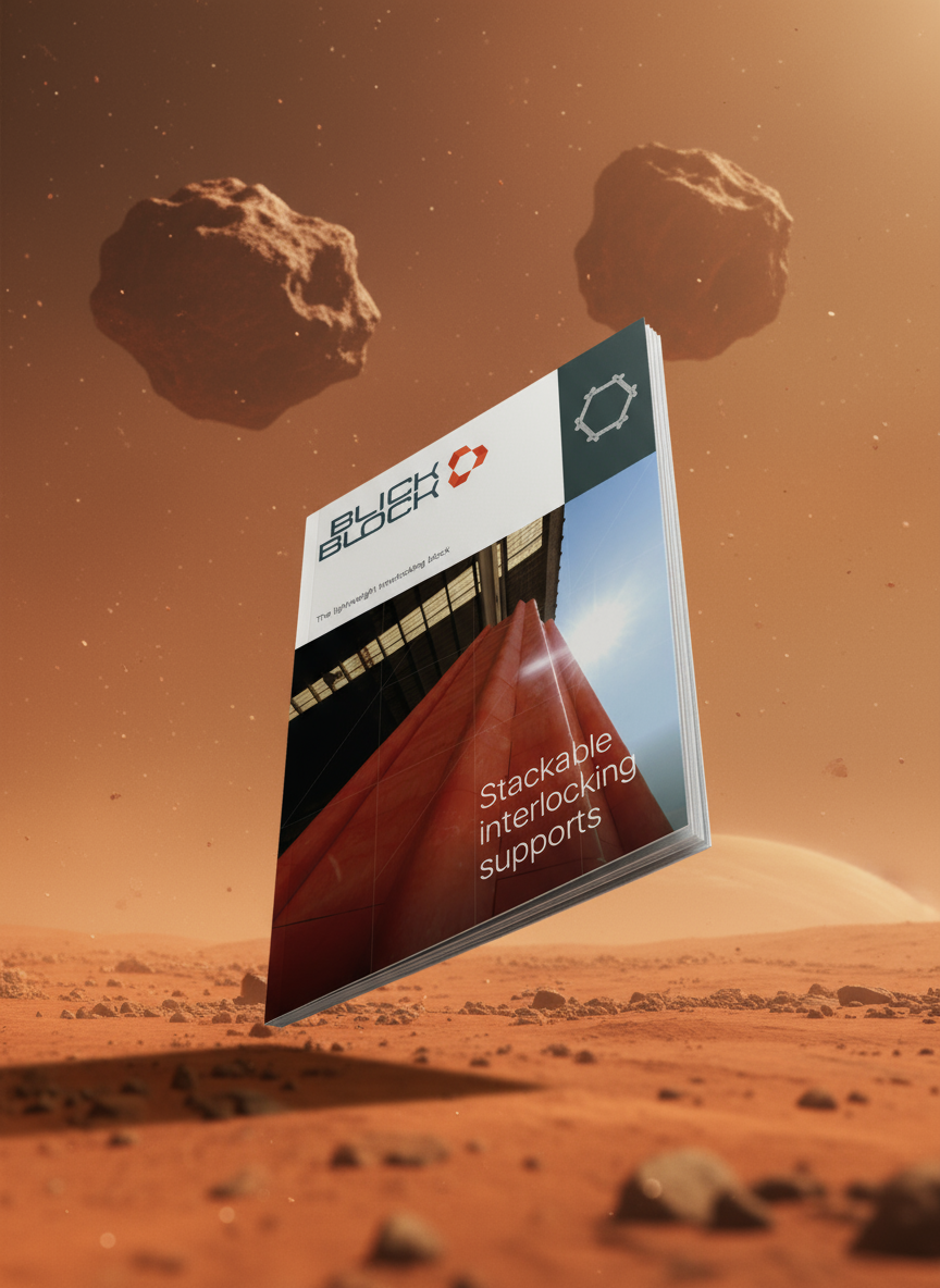
Rather than leading with engineering data, the capability statement focused on the problems BlickBlock solved. It highlighted how the lightweight design reduced injury risk, how the consistent quality eliminated the need for rework, and how the interlocking system saved time on site. The technical specifications were there — the 900-tonne load capacity, the 4.7kg weight per unit, the UV stability — but they supported the narrative rather than leading it.
The design maintained the strong orange and clean, technical aesthetic established by the logo. Every page reinforced the connection between the brand identity and the physical product, building recognition and trust.
Bringing It to Life Online
With the capability statement in hand, Nathan had a selling tool for direct conversations. But BlickBlock needed a broader presence — something that could explain the product clearly to people who’d never seen it in action.
This is where the challenge became more nuanced. BlickBlock wasn’t just a better version of something familiar; it represented a fundamentally different approach to underground support systems. Words and static images could only convey so much. The product needed to be seen working.
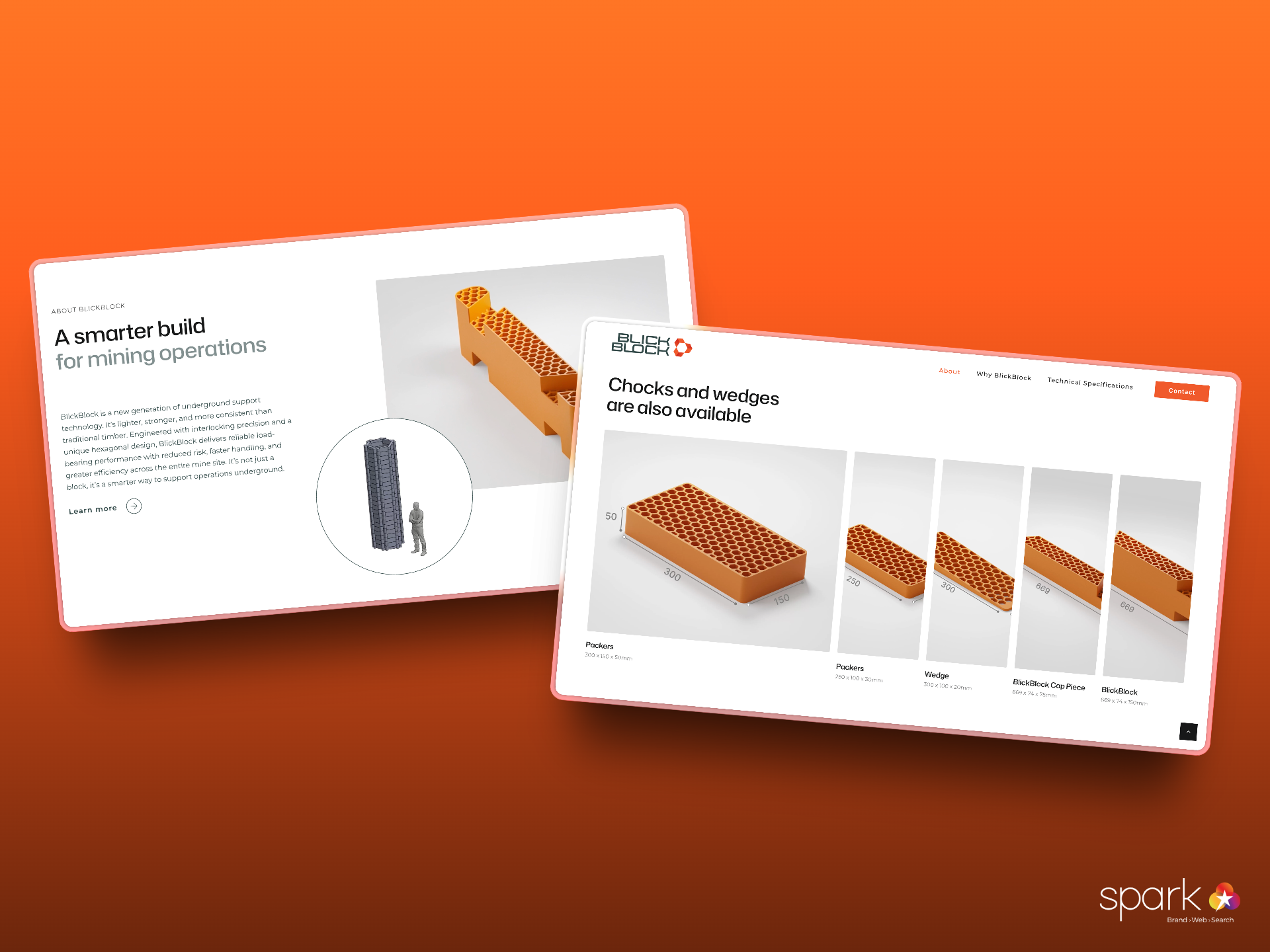
Mac, Spark’s motion designer, took on the task of creating a 3D video that would become the centrepiece of the BlickBlock website. The process required extensive collaboration with Nathan to understand exactly how the blocks functioned in practice.
“The foundation required a lot of resources, a lot of images from the client as actual demonstration for us to really illustrate how the blocks are coming together,” MaC recalled. Nathan provided detailed demonstrations and multiple angles of the blocks being assembled, which became the reference material for the 3D animation.
The video needed to do several things simultaneously: show the hexagonal structure that gave BlickBlock its strength, demonstrate how easily the blocks locked together, and convey the professional, engineered quality of the solution. MaC orchestrated the animation to build from individual blocks to a complete support structure, with the logo animation bookending the sequence.
“It takes a lot of time, a lot of iteration to make sure that it appears in the shape that we want it to be and really have to coordinate or orchestrate the way that the blocks come together to form something cohesive.”
Mac, Motion Designer
The final video transformed the explanation process. What might take several minutes to describe in conversation could now be understood in seconds. The animation showed BlickBlock in an idealised environment — clean lighting, precise movements, professional presentation — making the product look like the sophisticated engineering solution it was, rather than just another mining supply.
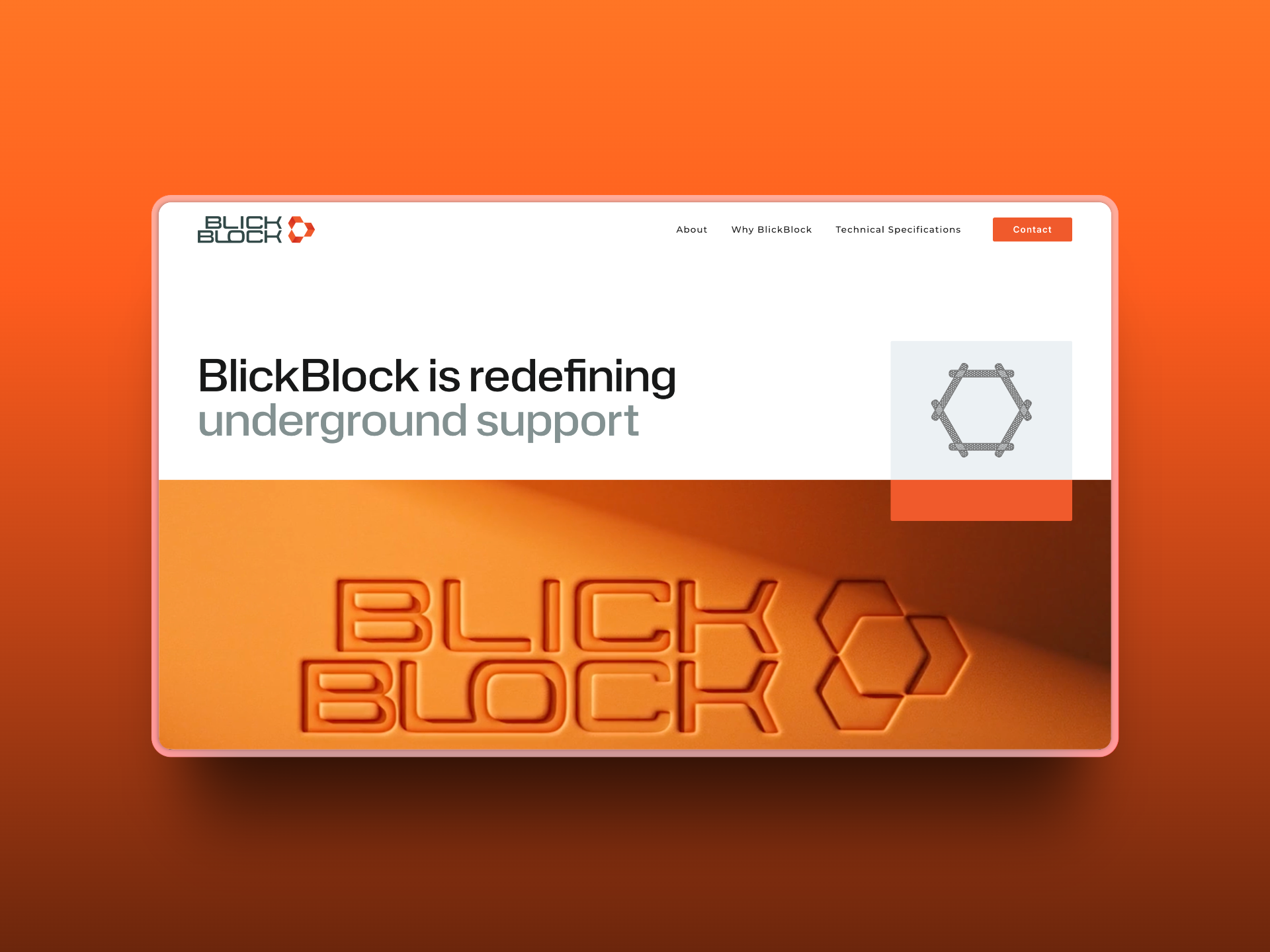
The website brought together all the elements Spark had developed: the distinctive orange and hexagonal branding, the clear articulation of benefits over timber, the technical credibility from university testing, and the video demonstration that made everything click into place. It positioned BlickBlock not as a startup with a prototype, but as a serious alternative to traditional systems.
Supporting the Business Behind the Brand
Beyond the visible brand work, Spark helped Nathan establish the digital infrastructure his growing business needed. This wasn’t glamorous work, but it was essential — particularly for someone who, as the team quickly learned, spent most of his time on the move rather than at a desk.
The team set up Nathan’s Google Workspace, consolidated his email accounts, and sorted out the domain management that had become tangled during the transition from Chowzaco to BlickBlock. They also resolved access issues with his previous email account that had left him locked out whilst driving between sites.
“He’s someone who’s not at a desk for very long,” one team member noted. “He was driving at the time and calling us on the phone trying to resolve it.” This insight shaped how Spark approached the technical setup — ensuring systems were accessible and manageable for someone operating a physical products business, not a desk-based service company.
The team consolidated all of Nathan’s digital assets — domains, hosting, email — into a coherent system where he could actually find things and know where they were. It was the kind of foundational work that doesn’t make it into marketing materials but determines whether a business can function smoothly as it scales.
From Prototype to Market Presence
What began as a rushed logo for prototype moulds evolved into a complete brand system that positioned BlickBlock as a credible player in mining innovation. The journey took roughly two years from that first urgent logo request to a market-ready brand with a professional web presence.
Nathan now has a capability statement that opens conversations, a website that explains his product effectively, and a video that serves as a powerful sales tool. More importantly, BlickBlock has a visual identity that matches the quality and innovation of the product itself — something that looks and feels as engineered and professional as the solution it represents.
The brand gives BlickBlock legitimacy in an industry where trust and proven performance are everything. When Nathan presents to mine site managers, he’s not showing up with a garage startup — he’s presenting a professional operation with rigorous testing, clear documentation, and a brand that signals serious intent.
For Nathan, who went from working underground to developing a product that could change how the industry operates, the branding was never just about looking good. It was about being taken seriously. It was about having the tools to communicate a genuinely better solution to an industry resistant to change.
“I think with a product like this where it’s something different, you can explain it in words, you can bring out the benefits, but the beauty of the video just totally transforms the way that people can quickly understand it,” reflected Kath. “People working in that industry particularly will recognise exactly what it’s for.”
BlickBlock’s story illustrates something Spark sees often: the best projects aren’t always the ones that follow the plan. Nathan’s willingness to work collaboratively, to provide the detailed information and demonstrations the team needed, and to trust the creative process whilst maintaining urgency around his manufacturing timeline, made the difference between a logo on a mould and a complete brand system ready for market.
The product does most of the talking now — lightweight, strong, sustainable, and proven. But the brand ensures people listen when it does.
Is your innovative product ready for market but lacking the brand presence to match? Spark Interact specialises in helping businesses tell their story and position their solutions professionally. Get in touch to discuss how we can help transform your offering into a market-ready brand.

