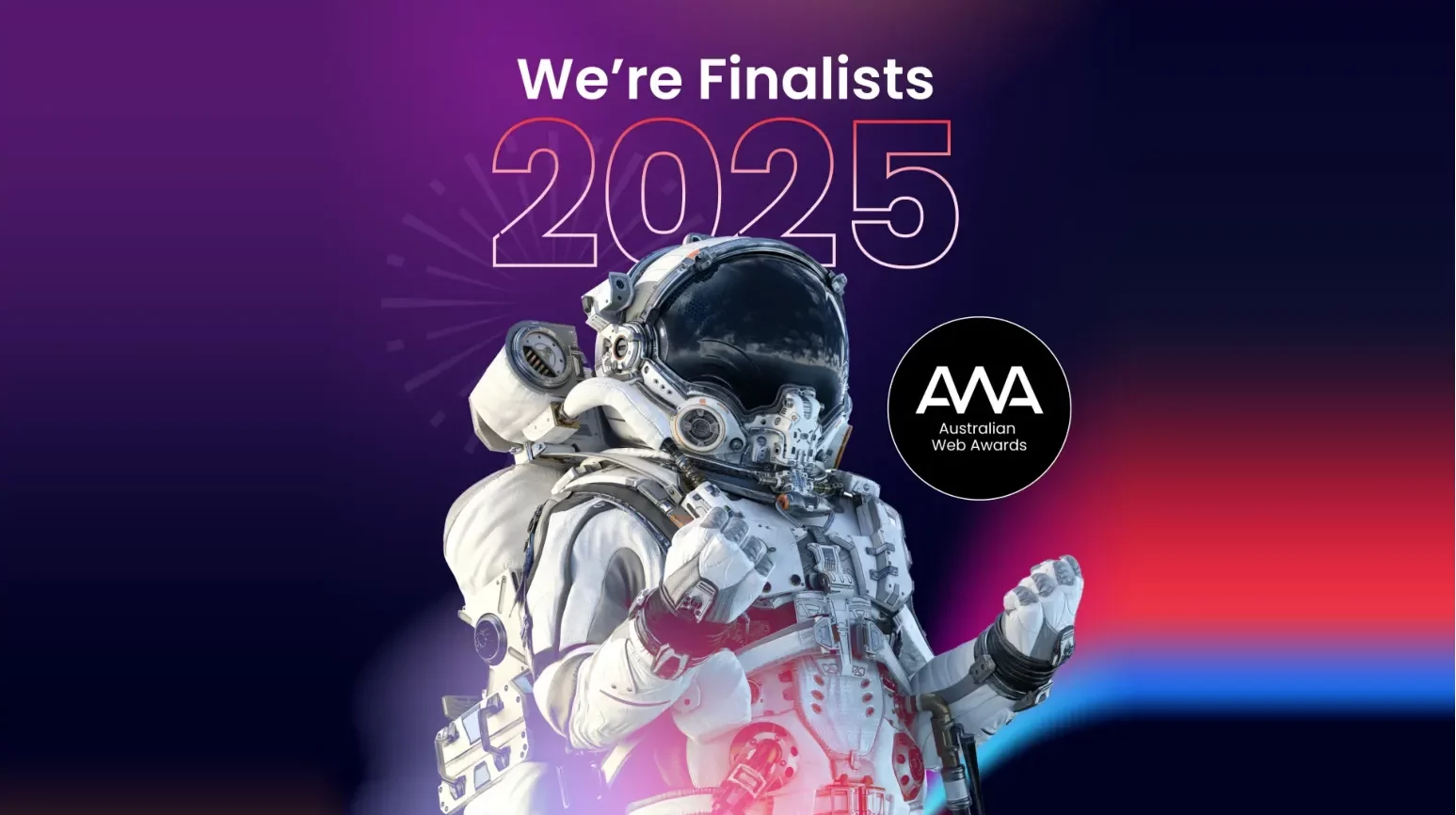
We’re excited to share that Spark has been named a finalist in three categories at the 2026 Australian Web Awards. This recognition celebrates more than just good design—it highlights how well-crafted digital experiences can deliver measurable impact for communities, industries, and organisations.
Among the finalists are two of our recent projects: the Carbon Farming Foundation website and the Liverpool Catholic Club Ice Rink website. While these clients serve entirely different audiences, their projects share something vital in common—a clear digital purpose, executed with strategy, creativity, and collaboration.
Two Very Different Briefs, One Shared Goal
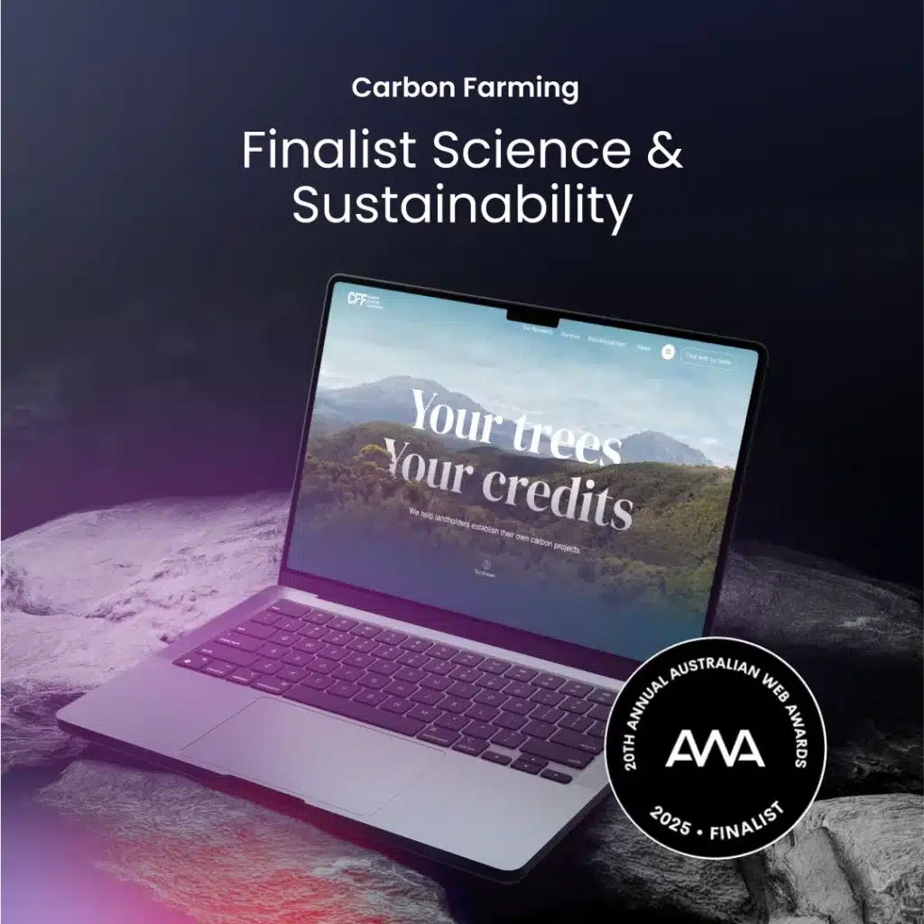
Let’s start with the clients. The Carbon Farming Foundation is a not-for-profit organisation helping landholders navigate the world of carbon projects. Their mission is technical, complex, and often misunderstood by the public. The challenge was to build a platform that demystifies carbon farming while guiding users—often regional landowners—toward helpful information and expert advice.
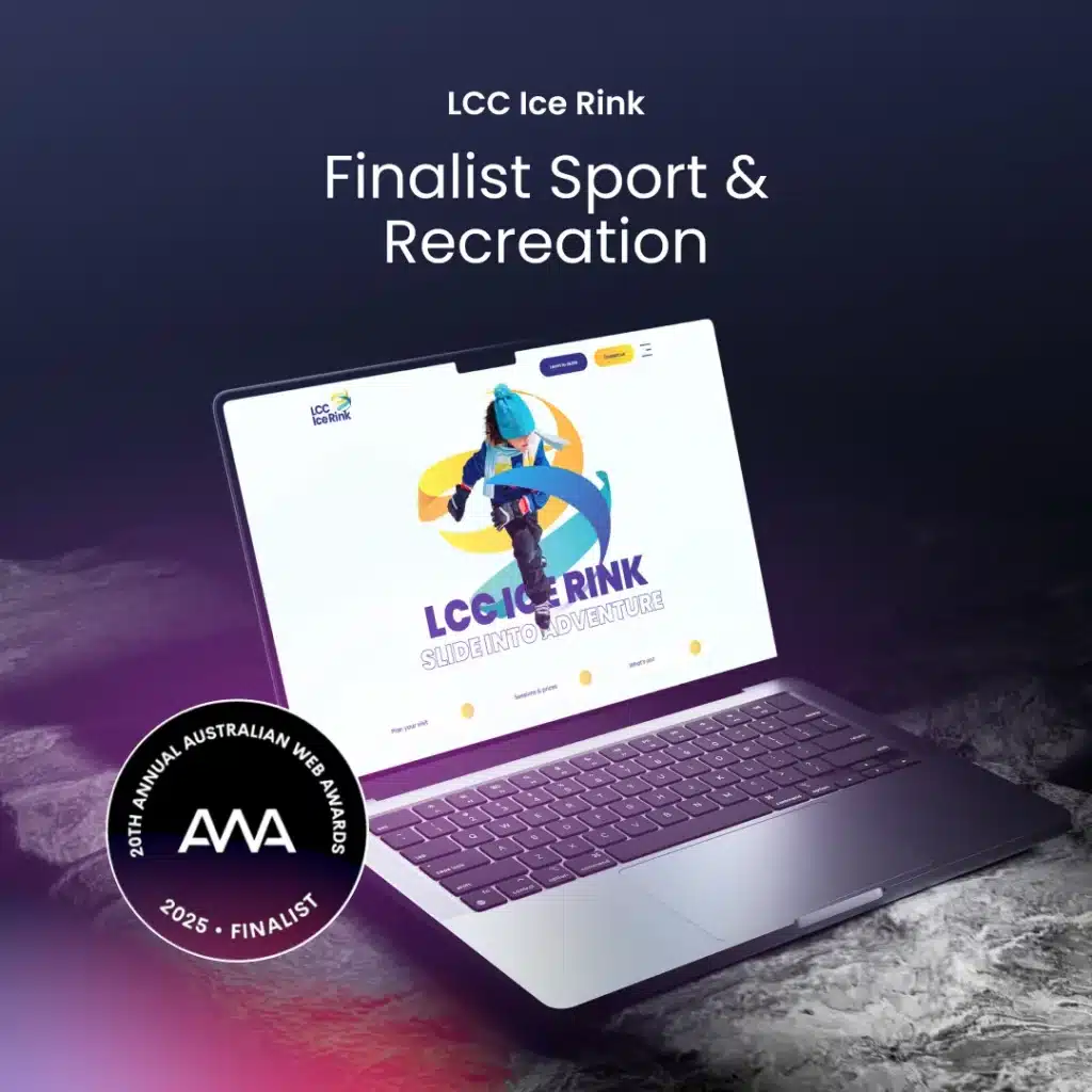
The Liverpool Catholic Club Ice Rink, by contrast, is an energetic, public-facing facility in Sydney’s west, open to families, schools, sporting groups, and birthday party-goers. Their challenge? They didn’t have a standalone website at all. Everything—from timetables to skating lessons—was hidden within the main club’s website. They needed a vibrant digital space to reconnect with the community and re-establish the rink as a fun, local destination.
Bringing Ideas to Life Through Design
Our design team tackled each project with a tailored approach that reflected each client’s distinct personality and goals.
Carbon Farming Foundation
For the Carbon Farming Foundation, we knew clarity and approachability were critical. The existing site was dense and difficult to navigate, filled with large blocks of text and little guidance. The brand’s broad colour palette and preference for Arial provided a clear foundation. In close collaboration with the client, we introduced complementary design elements to add warmth and structure while staying true to their vision.
We introduced a refined serif font for headings to complement Arial’s simplicity, creating visual hierarchy without overwhelming the client’s preferences. Custom illustrations of native Australian flora added visual interest and a clear sense of place, helping site visitors immediately understand the environmental nature of the work—even before reading a word.
A major design focus was the Education Hub, a central resource for users unfamiliar with carbon farming. This section was restructured to be highly accessible, easy to browse, and friendly in tone—key to empowering visitors with the knowledge they need to take action.
Liverpool Catholic Club Ice Rink
With LCC Ice Rink, the focus was all about energy, movement, and clarity. Because this was a new site build, we had the advantage of carrying over the strong branding we developed earlier for the ice rink. The ribbon-like elements of the logo inspired subtle animations and shape motifs used throughout the site, creating cohesion and a dynamic sense of flow.
A standout design element was the use of custom photography, featuring real rink staff and skaters. Directed by Spark’s Creative Team—Katherine Norris and Chau Nguyen—the shoot was carefully planned to align with the site’s design vision and brand personality. Every shot was considered for how it would integrate into layouts and reflect the energy of the rink. Beyond adding visual authenticity, it also helped avoid the generic North American stock imagery common in the category. The result was a vibrant, relatable visual experience that created a strong sense of local connection.
Building for Function and Flexibility
Great design is only half the story. Behind the scenes, our development team focused on building websites that are functional, scalable, and genuinely useful to the people running them day-to-day.
Carbon Farming Foundation’s Interactive Map
Perhaps the most technically ambitious element was the custom-built interactive map, created using SVG graphics and a third-party JavaScript library. It allows users to explore active carbon farming projects across Australia by region and project type. Each location is clickable, with a popup containing detailed information, and filters allow users to focus on what’s most relevant.
Our developers had to manually position every marker using a visual reference method (rather than geolocation), ensuring the experience remained responsive and consistent across devices. It’s an elegant solution to a complex brief—and one that provides the Foundation with a scalable tool as new projects roll out.
LCC Ice Rink’s Editable Calendar
On the LCC site, the hero functionality was an editable event calendar, a must-have for managing changing rink schedules, lessons, and events. We implemented a backend structure that allows the client’s team to manage updates without needing external support—a key requirement for sustainability.
From a technical standpoint, we also ensured all animations were lightweight and mobile-friendly. In fact, this was one of the first projects where we used Motion.page, allowing us to integrate subtle animations across all pages—not just the homepage. This consistency elevated the entire user experience.
A Truly Collaborative Process
One of the recurring themes in both projects was collaboration—between Spark’s designers, developers, and the clients themselves.
- Our teams consulted regularly to ensure animations translated smoothly from prototype to final build.
- Visual decisions, like colour and font changes, were negotiated with client input, balancing creative vision with brand alignment.
- Development solutions, like the interactive map and calendar, were co-designed around usability for the people maintaining the sites—not just end users.
Even the imagery, often a sticking point in web projects, was a joint effort. For LCC, we worked closely with their internal photographer to direct the shoot and plan compositions that would integrate seamlessly into our layouts.
Why These Sites Were Recognised
While they serve vastly different purposes, both websites demonstrate what can happen when great clients, creative problem-solving, and cross-functional collaboration come together.
The Carbon Farming Foundation site makes a complex topic digestible, while offering real tools to encourage change. The LCC Ice Rink site reconnects a community with a much-loved facility, bringing joy, clarity, and functionality to users of all ages.
Both are designed not just to look good, but to do good—and that’s a principle we carry into every project we take on.
As a full-service branding agency, we believe design should not only reflect brand identity but also deliver meaningful outcomes for users.
Looking Ahead
Recognition at the Australian Web Awards is something we’re deeply proud of. It affirms our belief that digital work can make a meaningful difference—and that thoughtful, strategic execution will always rise to the top.
To the Carbon Farming Foundation and the team at Liverpool Catholic Club: thank you for the opportunity to bring these digital spaces to life.
Here’s to many more projects that inspire, inform, and engage.