
 ChatGPT
 Claude
 Perplexity
 Gemini
TL;DR
Web designers don’t need to be SEO experts, but they do need the right tools. These eight make it easy to build sites that look great and perform — from quick browser audits with Detailed SEO Extension and SEOquake to performance testing with Lighthouse and PageSpeed Insights.
Add them to your workflow and you’ll catch issues earlier, improve site speed, and hand over websites that rank as well as they’re designed.
Designing a website that looks good is easy. Designing one that performs well across search engines, devices, and audiences? That’s where the real skill comes in.
For web designers, SEO isn’t some extra checkbox anymore — it’s part of the craft. Every layout, image, and line of code shapes how search engines see a site. When web design and SEO work together, the right tools can make that process smoother, helping you spot issues early and build smarter from the start.
Here are eight SEO tools worth adding to your workflow — practical, easy to use, and built to help your designs work as well as they look.
Why web designers need SEO tools in their workflow
Every design choice shapes how a website performs online. From layout and load time to accessibility, SEO tools help make sure your work looks great and ranks well.
Here’s why they matter:
- Clients expect results. Around 70% of Australians research a business online before buying, so visibility is part of the design brief now.
- Search engines read your design. Google evaluates structure, speed, responsiveness, and accessibility — the things you already control.
- Fixing later costs more. Building with SEO in mind prevents post-launch headaches and redesigns.
- They make your job easier. Tools automate checks for errors you might miss, saving hours of manual review.
Good design has always balanced form and function — SEO tools just help you prove it.
Common SEO mistakes web designers make
Even experienced designers slip up on the technical side. A few small oversights can hurt a site’s visibility before it even launches.
The most common ones:
- Skipping the basics. Missing meta descriptions, broken heading structures, and forgotten alt text make it harder for search engines to understand the page.
- Overloading visuals. Massive hero videos, oversized images, and fancy effects look great but slow everything down — especially on mobile.
- Ignoring semantic HTML. Using random <div>s instead of proper tags (<header>, <nav>, <article>) confuses both crawlers and assistive tools.
- Forgetting accessibility. Poor contrast, unreadable text, and missing labels aren’t just bad for users — they can also impact rankings.
Design and SEO don’t compete with each other; they work best together. A well-built site should look good, load fast, and make sense to both people and search engines.
The essential SEO tools for web designers
Now that we’ve covered the “why,” let’s look at the “how.”
These tools are the ones that actually make SEO part of your design process — not an afterthought. Each one solves a common problem you’ll face when building, testing, or launching a site.
1. Detailed SEO Extension – Quick page insights while you design
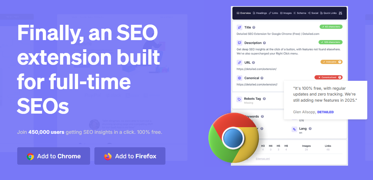
Think of this as your on-page audit button.
With one click, Detailed SEO Extension shows you everything search engines see — title tags, meta descriptions, heading order, alt text, and structured data.
Why it’s useful:
- Gives instant feedback while you’re working in the browser.
- Highlights heading hierarchy so you can spot structural issues before launch.
- Checks for missing schema markup or duplicate tags without leaving your design view.
For designers who don’t have time to deep-dive into SEO tools, this one delivers the essentials fast. It’s simple, free, and ideal for quick health checks as you build.
2. SEOquake – Quick competitor and SERP analysis
When you need to understand why a competitor’s site ranks higher, SEOquake gives you the data right where you’re already working — on the search results page. It overlays useful metrics like domain authority, backlinks, and indexed pages directly onto Google, so you can see what’s driving those top spots without opening a dozen tools.
Here’s what makes it useful:
- Shows key SEO metrics instantly as you browse search results
- Highlights competitor content length, keyword use, and metadata structure
- Helps identify ranking patterns across similar sites in your client’s industry
- Lets you tailor your designs and content recommendations based on real performance data
It’s one of those tools that quietly sharpens your instincts. Instead of guessing what works, you start to recognise the SEO signals behind high-ranking pages — and that insight naturally shapes how you build, structure, and present your own projects.
3. Wappalyzer – See the tech behind any site
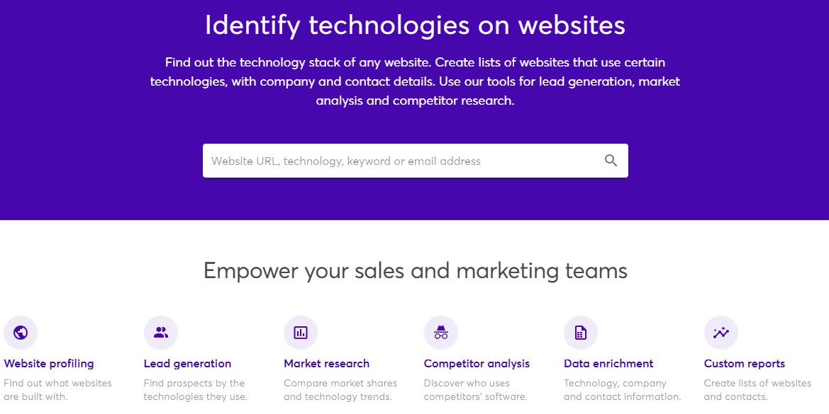
Ever had a client say, “We like this website — can we do something similar?” and you’re left wondering what platform or plugins that site even runs on? Wappalyzer answers that instantly.
It scans any website and reveals its entire tech stack — CMS, ecommerce platform, analytics tools, frameworks, and even hosting providers. It’s a quick way to understand what powers the sites your clients admire or compete with.
Some ways designers use it:
- Research what’s common in their client’s industry — WordPress, Shopify, Webflow, or custom builds
- Check which integrations or plugins successful competitors rely on
- Make smarter recommendations based on technology that’s proven to work locally
In Australia, WordPress still dominates business websites, followed by Shopify for ecommerce. Knowing that helps you align suggestions with tools your clients can actually manage. Wappalyzer turns that guesswork into informed, confident advice — a small edge that builds a lot of trust.
4. Google Lighthouse – Measure real performance
Design might catch attention, but performance keeps people on the page. Google Lighthouse helps you see how well a site actually runs — from loading speed to accessibility.
It tests key metrics known as Core Web Vitals, which tell you how fast the main content appears, how quickly the site responds to clicks, and how stable the layout is while loading.
- Largest Contentful Paint (LCP): how fast the main content loads
- First Input Delay (FID): how quickly the site reacts when someone clicks
- Cumulative Layout Shift (CLS): how stable the layout stays as elements load
The tool scores pages separately for desktop and mobile, showing where performance dips. It also flags accessibility issues — colour contrast, missing labels, or navigation gaps — that can hold a site back from meeting Australian standards like WCAG 2.1.
For designers, Lighthouse turns vague “speed” complaints into something measurable. You can test, adjust, and show proof of improvement — a quick report that backs up your design decisions with data.
5. PageSpeed Insights – Real-world speed testing
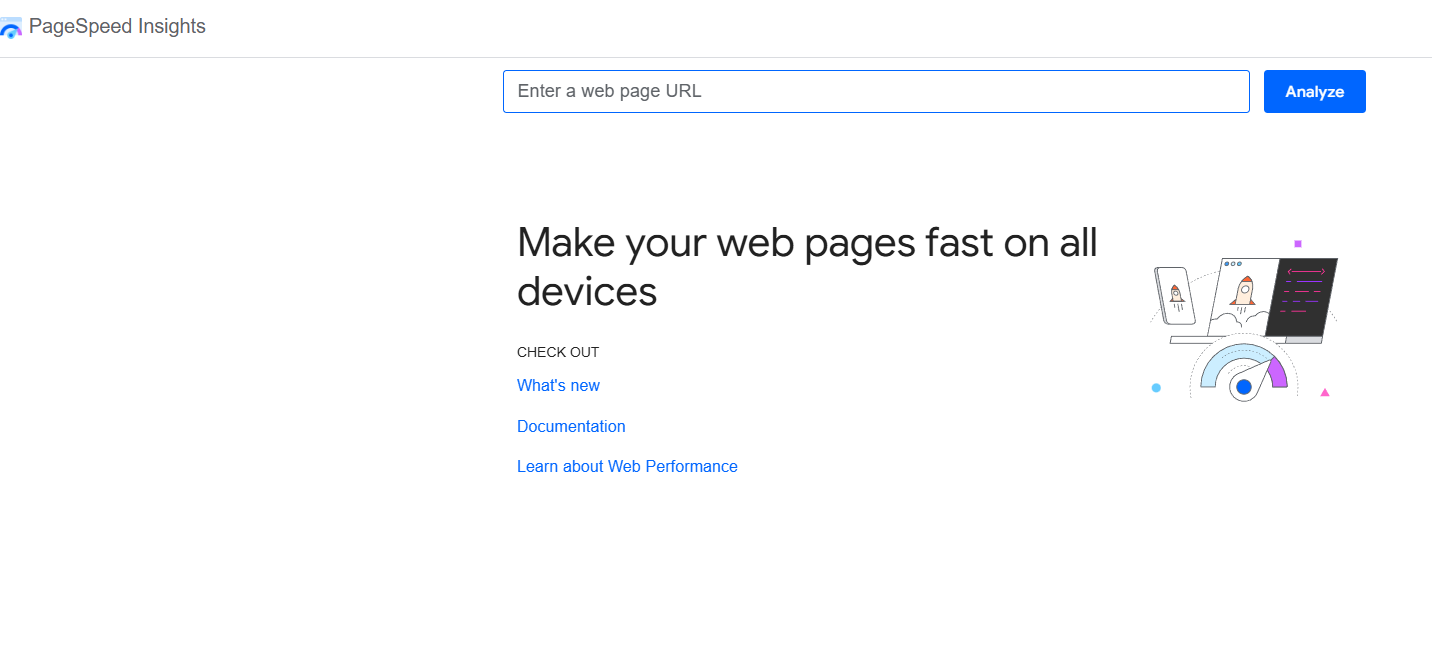
If Lighthouse tells you how a site should perform, PageSpeed Insights shows how it actually performs for real users. It uses both lab tests and live data from Chrome users to show what visitors experience day to day.
- Combines Lighthouse’s technical tests with real-world loading data
- Highlights slow elements like large images, render-blocking scripts, or missing caching
- Suggests clear fixes such as next-gen image formats (WebP, AVIF) or lazy loading
- Breaks down performance by device type, so you can see how mobile users are affected
It’s especially helpful for clients who think their site “feels fine” because they’re testing it on a fast connection. PageSpeed Insights shows what’s really happening on average networks — a perspective that keeps your builds grounded in how Australians actually browse.
6. Mobile Simulator – Test how your design really feels on mobile
With more than half of Australia’s web traffic coming from phones, mobile performance isn’t optional — it’s the standard. Mobile Simulator lets you see how a site behaves across different devices and screen sizes, without needing a stack of phones on your desk.
- Preview layouts on iPhone, Android, and tablet screens directly in your browser
- Catch issues like tiny text, buttons that sit too close together, or sections that break the layout
- Check viewport settings to make sure the design adjusts properly across screen sizes
Testing mobile versions throughout the build — not just at launch — saves a lot of rework. It’s easier to tweak spacing, typography, and images as you go than to fix them after the site is live. A quick run through Mobile Simulator can be the difference between “looks fine” and “feels seamless.”
7. Redirect Path – Catch redirect and error issues early
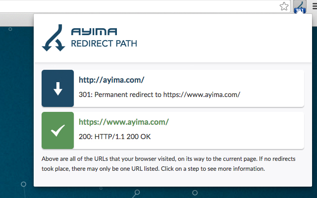
Redirects might seem minor, but they can seriously affect how search engines crawl and rank a site. Redirect Path tracks every URL you visit and flags any redirects or errors before they become problems.
- Shows status codes in colour — green for success (200), orange for redirects, red for errors
- Helps you spot unnecessary redirect chains that waste crawl budget and slow down page loading
- Differentiates between 301 (permanent) and 302 (temporary) redirects so you can manage link equity properly
- Flags 404 errors so you can fix or redirect missing pages
For large websites or redesigns, it’s an easy way to keep links clean and SEO intact. A quick check during development ensures every page leads exactly where it should — no broken paths, no ranking drops.
8. Check My Links – Find broken links before launch
Few things hurt a website’s credibility faster than broken links. Check My Links scans a page in seconds and highlights every valid and broken link so you can fix them before a site goes live.
- Marks working links in green and broken ones in red for quick visual review
- Checks both internal and external links across your pages
- Helps clean up old blog posts, migrated content, or duplicated pages where links often get lost
- Prevents wasted crawl budget and user frustration caused by dead ends
It’s one of those quick, no-excuse tools that instantly improve quality. Running a check before handover shows attention to detail — and helps clients launch with confidence that everything works as it should.
How to integrate these tools into your design process
Using SEO tools doesn’t have to slow you down. The trick is to weave them naturally into each stage of your workflow — not treat them as a separate checklist at the end.
Here’s how it fits:
- Discovery: Run a quick SEOquake and Wappalyzer check on competitor sites to see what’s working in your client’s industry.
- Design: Use Lighthouse to set performance targets early. It’s easier to meet them when you design with those limits in mind.
- Development: Keep Detailed SEO Extension open while you build so you can catch missing tags, headings, or alt text on the spot.
- Pre-launch: Scan the final site with Redirect Path and Check My Links to make sure there are no dead ends or redirect issues.
When these tools become part of your process, SEO stops feeling like a technical chore and starts becoming second nature. You’ll catch problems earlier, hand over cleaner builds, and give clients something better than promises — proof.
Setting client expectations with data
Good design speaks for itself, but data helps your clients understand why it works. SEO tools give you that evidence — real numbers that turn “trust me” into “here’s the proof.”
A few ways to use them:
- Show before-and-after scores from Lighthouse to highlight measurable improvements
- Share PageSpeed Insights results to explain how optimising images or scripts makes a difference
- Use redirect or broken link reports to show the clean-up work clients rarely see but always benefit from
When clients see performance scores improve or loading times drop, they start viewing SEO as part of good design — not an added service. It’s a simple way to build trust and demonstrate that your designs don’t just look great; they perform where it matters.
Conclusion
SEO isn’t separate from design — it’s part of it. The right tools make it easier to build websites that look good, load fast, and rank well without adding more work to your plate.
Start small. Add one or two of these tools to your next project and see how much smoother the process becomes. Over time, you’ll catch issues faster, explain decisions with data, and deliver results clients can actually see — on screen and in search.
Design meets performance with Spark. Let’s make your next project stand out — and get found.