When Apple unveiled their revolutionary Liquid Glass design language, our team gathered to dissect what this could mean for the future of digital experiences. What emerged from our discussion wasn’t just admiration for Apple’s technical prowess, but a deeper conversation about where design is heading and how we, as creators, need to evolve alongside it.
Source: Apple
The Physical Meets Digital Revolution
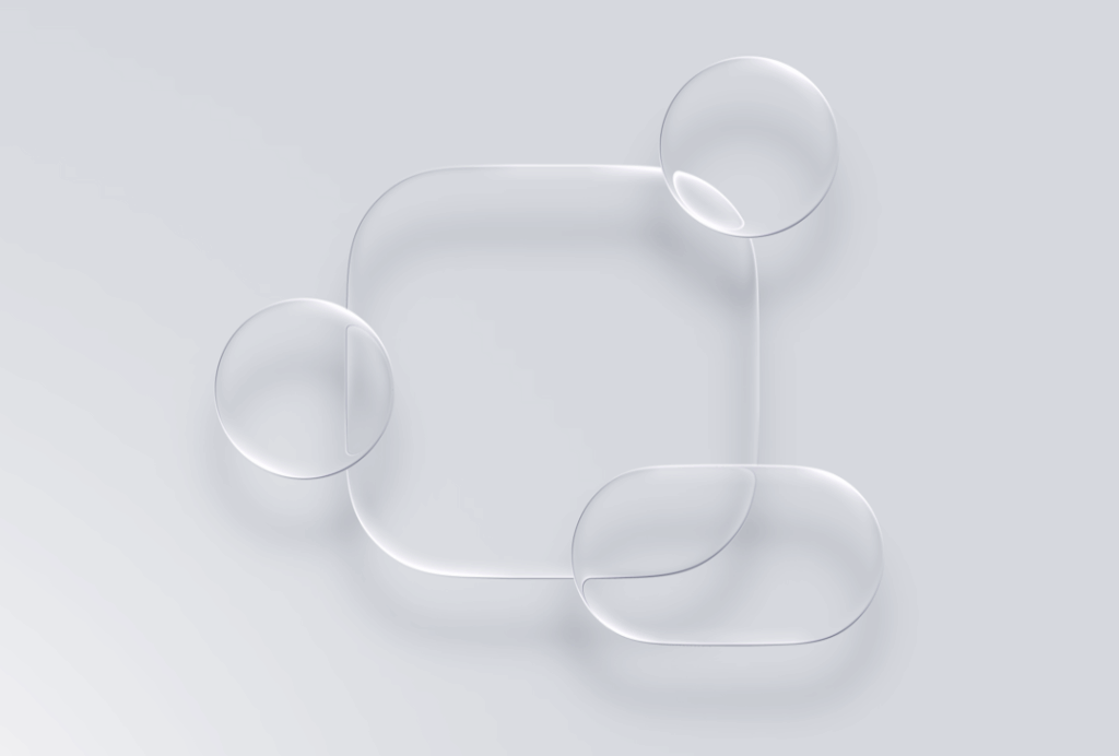
Apple’s Liquid Glass represents something we’ve been watching unfold across the tech landscape — the deliberate blurring of boundaries between physical and digital experiences. As we watched the demonstration, it became clear this wasn’t just another visual update. This was Apple’s attempt to bring the intuitive physics of the real world into our screens.
What’s particularly fascinating is that Liquid Glass isn’t actually a radical departure for Apple — it’s a sophisticated return to their roots. Looking back at early iOS versions, the original interface was rich with skeuomorphic design: glossy buttons that looked like physical switches, photo apps with realistic camera shutters, and bookshelves that mimicked real wood grain. Apple pioneered this approach of making digital interfaces feel tangible and familiar.
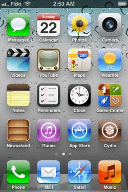
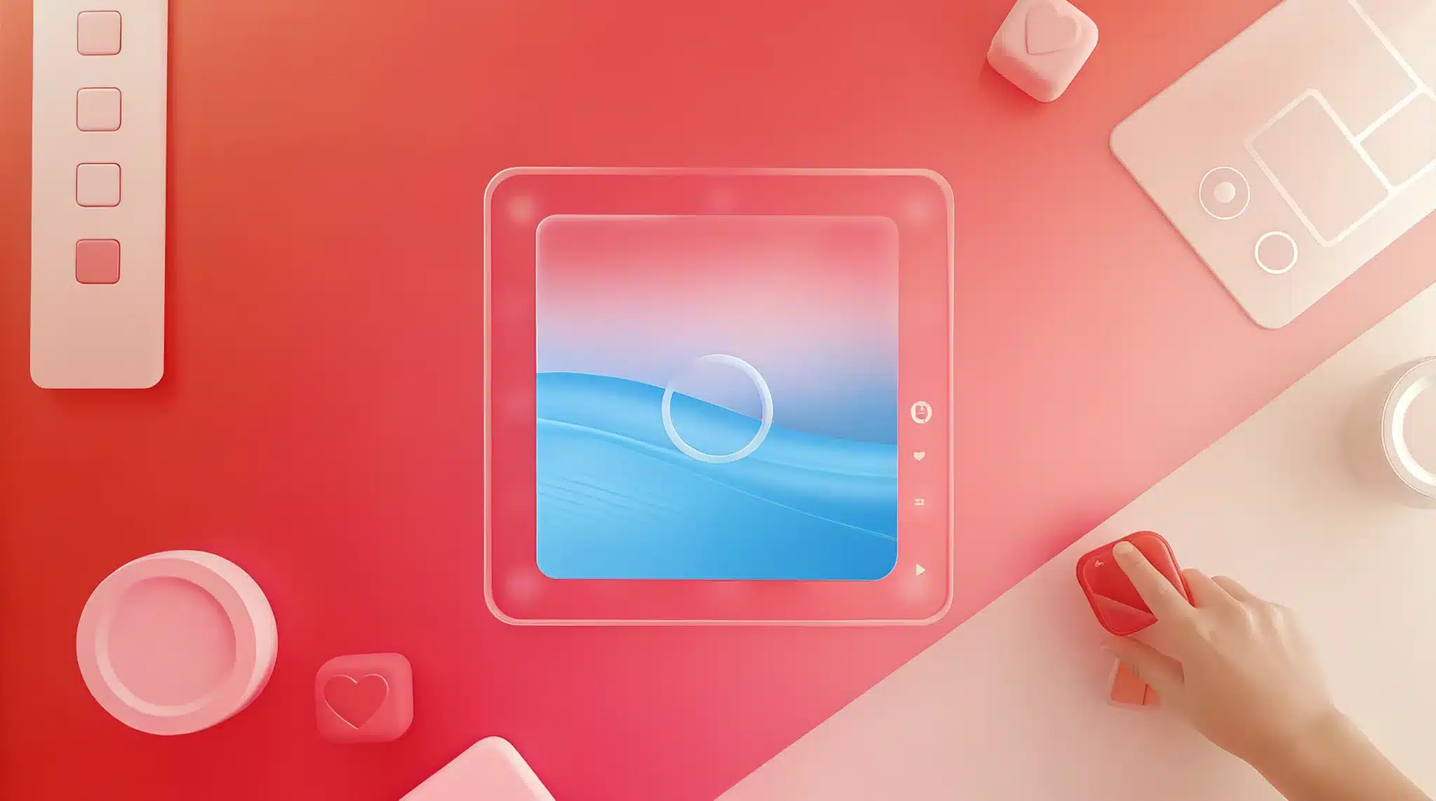
IOS 3
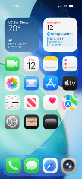
IOS 26
After years of embracing flat design minimalism, Liquid Glass signals Apple’s evolution back toward skeuomorphism, but with a distinctly modern twist. Rather than simply mimicking surface textures, they’re now simulating the actual physics of materials — how light bends through glass, how surfaces reflect their surroundings, how elements respond organically to touch. It’s skeuomorphism 2.0: not just looking like real materials, but behaving like them.
“They’re bringing actual real-life material to the digital world,” observed Mac, Marketing Specialist, capturing what felt like the core insight of the entire presentation. The way light bends around transparent objects, how liquids respond to touch, the subtle reflections that help us understand depth and form — Apple has systematically translated these physical phenomena into digital interactions.
This approach extends far beyond Apple. We’ve seen Microsoft experimenting with blur gradients and bento box designs, Google exploring material depth, and now Apple pushing the envelope with dynamic light manipulation. There’s a clear industry trend toward what we’re calling “experiential design” — interfaces that don’t just function but feel tangible.
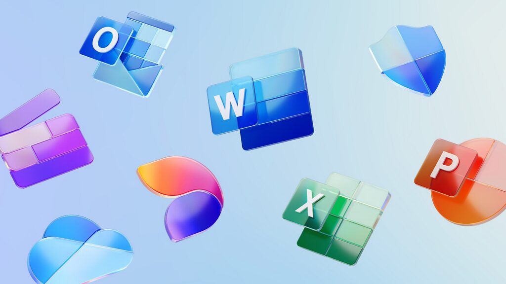
Microsoft 365 App Logo Designs
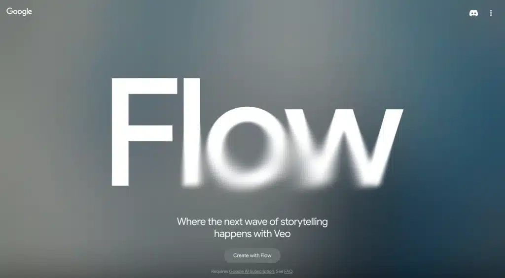
Google Flow LP Hero Design
The Developer’s Dilemma
Watching the seamless morphing animations and dynamic light effects, our development team had a collective moment of “how on earth do they do that?” The technical complexity behind making UI elements that respond organically to touch, that bend light in real-time, and that transition fluidly between states is staggering.
“I imagine it’s all maths, right? The scattering of natural light is a hard thing to simulate without very complex equations,” Ben, Content Strategist, reflected, highlighting the sophisticated mathematics underlying what appears effortlessly beautiful.
Source: Apple
The performance implications are enormous. Every element now requires real-time calculations for light bending, dynamic colour adaptation based on background content, and fluid morphing between states. For a company supporting devices back to iPhone 11, the optimisation challenge is immense.
Yet within hours of Apple’s announcement, Framer had already introduced support for Liquid Glass effects. This rapid adoption by design platforms signals that these concepts, while technically challenging, are becoming the new baseline expectation for premium digital experiences.
Source: Apple
The Accessibility Question
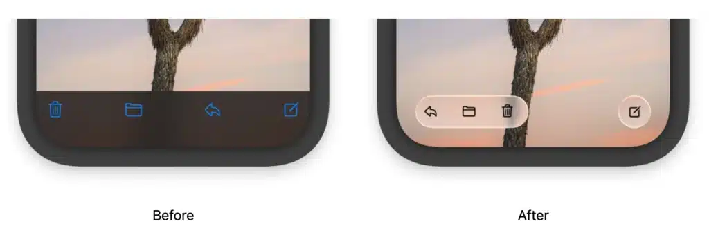
Perhaps the most sobering moment in our discussion came when examining the practical implications of these ultra-transparent, morphing interfaces. While undeniably beautiful, the subtle distinctions created by light-bending effects raise genuine concerns about accessibility and usability.
“It’s cool, but at the same time, you have to really pay attention to actually see what is there,” noted Marcela, Experienced Designer, touching on a fundamental tension in modern interface design. Apple has historically prioritised visual innovation alongside functionality, but Liquid Glass pushes that balance further toward aesthetic experience.
The challenge isn’t just visual accessibility — it’s cognitive load. When every interaction triggers dynamic responses and interfaces constantly shift their appearance, users must work harder to maintain spatial awareness and predict interface behaviour.
Source: Apple
Implications for Our Practice
This evolution challenges us to reconsider our approach across multiple dimensions. We identified four key areas where Liquid Glass thinking could influence our work:
Design Philosophy: Moving beyond static layouts toward interfaces that feel alive and responsive. This means considering how elements should behave, not just how they should look.
Animation Strategy: Rather than treating animation as decorative enhancement, we need to view it as fundamental to how interfaces communicate state, hierarchy, and possibility.
Technical Implementation: The gap between design ambition and technical feasibility has widened. We need to develop deeper collaboration between design and development teams, and possibly explore new platforms and tools.
Performance Optimisation: Creating fluid experiences requires addressing fundamental performance constraints. This might mean reconsidering our current technology stack and workflows.
Looking Forward
Apple’s Liquid Glass isn’t just a design trend — it’s a statement about the future of digital interaction. As augmented reality, virtual reality, and mixed reality technologies mature, the distinction between physical and digital experiences will continue to blur.
For design agencies, this creates both opportunity and obligation. Clients will increasingly expect interfaces that feel as responsive and intuitive as physical objects. The question isn’t whether these expectations will become mainstream, but how quickly we can adapt our capabilities to meet them.
The most successful design teams will be those who can navigate the tension between cutting-edge visual innovation and practical accessibility, between technical ambition and project constraints, between following trends and solving real user problems.
Apple has once again shifted the conversation about what digital experiences can be. Now it’s up to the rest of us to figure out how to make these visions work in the real world — for real users, with real constraints, solving real problems.
As we continue exploring these new possibilities, one thing remains clear: the future of digital design isn’t just about how things look, but how they feel, behave, and respond. The most compelling interfaces will be those that don’t just function — they’ll feel alive.