 ChatGPT
 Claude
 Perplexity
 Gemini
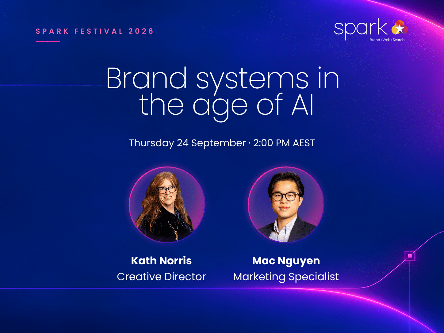
Your team probably already uses AI to write and design things for your business. But how do you make sure what it creates still looks and sounds like your brand?
That was the question behind our second Spark Festival 2026 webinar on 24 September, Brand systems in the age of AI. Mac and I explored what keeps a brand recognisable as AI becomes a bigger part of everyday creative and marketing work.
Would you still know it?
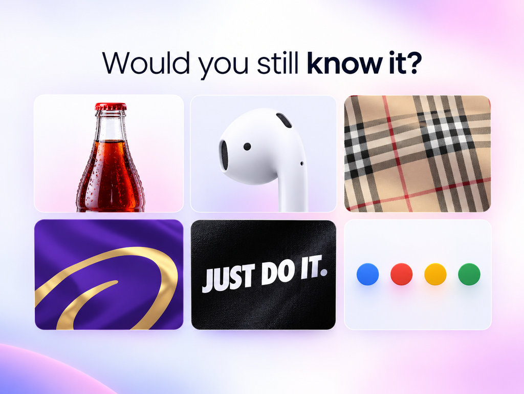
We started with a quick exercise. Six slides, one picture on each, and no logos:
- The shape of a bottle
- A white earbud
- A check pattern
- Purple with a gold swirl
- “Just do it.” in white capitals on black
- Four dots in blue, red, yellow and green
Coca-Cola, Apple, Burberry, Cadbury, Nike and Google. Most people recognise all six without seeing a single logo.
That’s the point.
When people think about a rebrand or a refresh, they often think it means creating a new logo and then the job is done. But a brand is much more than that. It’s how your brand looks, but also how it feels, how it sounds, how it moves and sometimes even how it smells.
One example I shared was Lush. You can smell a Lush shop from 50 metres away and know it’s there before you even see it.
Mac raised another good example: the Netflix sound. You don’t need to look at the screen. You hear it and immediately know what it is.
Recognition comes from much more than a logo.
What is a brand?
To make it simple, I think of a brand as what people remember, feel and believe about you.
Remember is recognition. How do people know it’s you?
Feel is the reaction people have when they come into contact with your brand.
Believe is trust. It’s where trust gets built, and it can be lost just as easily.
A brand is also built over time. The Qantas kangaroo has been on Qantas planes since 1944. Its shape has changed over the years, but the fundamentals have remained recognisable.
Branding is a practice. It isn’t a logo job with an end date.
Most choices are made fast
Think about rushing into a supermarket for an energy drink.
You’ve got a choice of Monster, Lucozade or Gatorade. You’re probably not going to stand there for an hour analysing every option. You want something cold, you recognise something familiar and you make a choice.
Some decisions take longer. If you’re buying a car, you’ll probably do some research. But that isn’t how we approach every choice we make.
A lot of decisions happen quickly.
A brand that keeps changing, or doesn’t seem to know what it is, makes that quick decision harder. And when something feels unfamiliar or inconsistent, people may simply move on.
There are three things I keep coming back to when we talk about building recognition:
Keep it consistent. People need to see the same patterns repeatedly. The colour, the shape, the typography, the language and the other elements all start to connect back to the brand.
Show up consistently. Every time someone encounters your brand is another opportunity to strengthen that recognition.
Create the right feeling. People remember experiences that make them feel something, whether that’s trust, excitement, confidence or familiarity.
Brand drift
When a company grows, or more people start working with the brand, small inconsistencies can creep in.
That’s brand drift.
It usually isn’t the result of one bad decision. It happens gradually through lots of small ones.
One example I shared in the webinar was someone new joining a business and being asked to make a newsletter.
They can’t get the correct font working on their computer, so they choose something that looks close enough.
Then they can’t find the exact brand colour and think, “It’s a blue, so I’ll just use a blue.”
Nothing looks dramatically wrong on its own.
But when enough people make those small decisions, the brand slowly starts to change.
Eventually, customers can start to notice too. Things don’t quite look like they did before. The experience feels different. They may even start wondering whether something about the business itself has changed.
That’s why consistency matters. It isn’t about being overly strict. It’s about protecting recognition and trust.
From a brand to a brand system
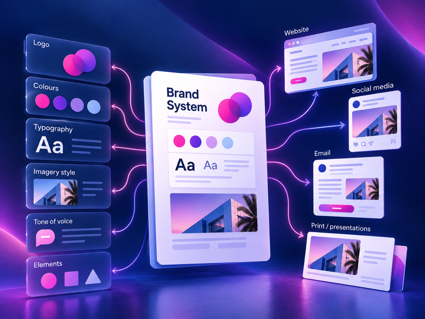
As a brand grows, you need a clear set of rules for how it should look and sound across different channels.
That’s where a brand system comes in.
A brand system shapes how people recognise you, how comfortable they feel choosing you and how they understand your value without having to be told every time.
The most familiar part of that system is usually the brand guideline.
It might set out your logo and how to use it, your colours, typography, values and other visual rules. These are your brand assets: the things people come to associate with you.
Then there are your touchpoints: all the places those assets appear.
Your website. A brochure. A newsletter. Social media. Even the way someone answers the phone.
And there are more brand assets than people sometimes realise. A distinctive pattern can become an asset. So can a mascot. So can a sound.
Some elements should stay fixed. Your logo, typography and core colours will usually sit here.
Others can flex. A campaign might introduce a slightly different visual style while those core elements stay recognisable.
The important thing is that a brand system shouldn’t become the brand police.
Mac made a good point during the webinar. Imagine starting a new job, being asked to create a newsletter before the end of the day, and being handed a 200-page brand guideline.
Technically, all the rules might be there.
Practically, it’s almost impossible to use.
If a system is too difficult to work with, people will find ways around it. That’s when brand drift starts again.
A website is a brand touchpoint
A website isn’t just a business card with your logo on it.
It’s an experience people have with your brand.
They need to find information quickly. Buttons and links need to behave consistently. Navigation needs to make sense. The experience should feel intentional from one page to the next.
If a customer has a bad experience on your website, they don’t separate that from the brand. They carry that experience with them.
For an online shop especially, things like speed, ease of use, responsive interactions and a smooth checkout are part of how people experience the business.
Your brand isn’t only what something looks like.
It’s also what interacting with it feels like.
Your brand now has another audience
Brand guidelines have traditionally been made for people.
Your team reads them and uses those rules to create newsletters, social posts, documents, presentations and other brand material.
Now AI is entering that process too.
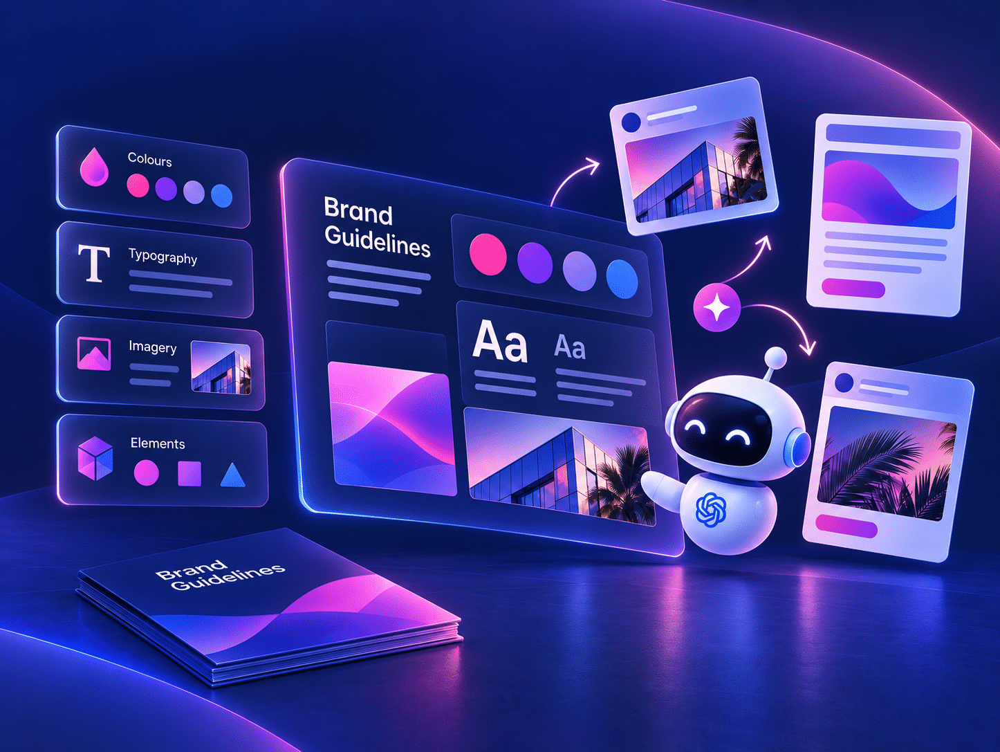
Teams are using tools like ChatGPT, Claude and other AI platforms to produce work faster. Something that once took hours might now be generated in minutes.
But that raises an important question:
How do you make sure what AI creates is still on brand?
A person can often work around gaps in a brand guideline.
Someone with design experience can look at a situation that isn’t covered and make a judgement call based on the rest of the brand.
AI is much more dependent on the boundaries and examples you give it.
If those rules are unclear, incomplete or inconsistent, the output is much more likely to drift too.
That’s why a brand guideline is useful, but for more complex digital work, a design system becomes even more valuable.
A design system goes further. It defines how the individual parts of an experience should work together, from something as small as a button through to an entire page.
With clear guardrails, both your team and AI have a much better foundation to work from.
Without them, AI can simply reproduce the inconsistencies already sitting inside the system.
A real example: North Sydney Olympic Pool
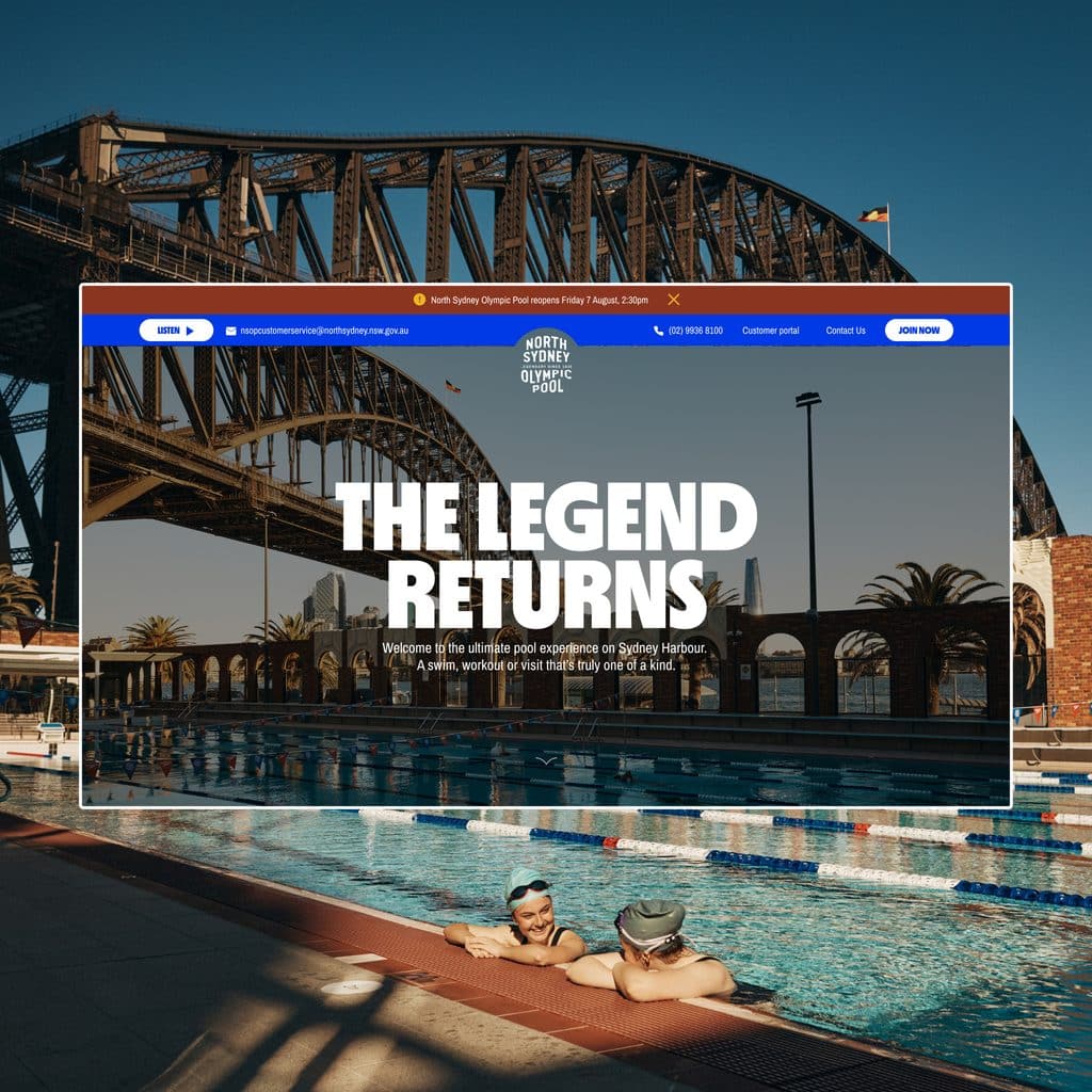
We built the website for North Sydney Olympic Pool and created a detailed design system around it.
The branding had already been developed by a leading Sydney design agency. It was a beautiful, fun, retro identity with clear rules around the logo, colour pairings and a set of pictograms.
The brand guidelines were thorough, but they didn’t explain exactly how all of those elements should translate into a digital experience.
That was our job.
We wanted to bring the personality of the brand into the website while still making practical information, like swimming lessons and facilities, easy to find and use.
So we built the system in four levels.
1. Foundations
Typography, sizes, spacing, colours, shadows, icons, pictograms and the logo.
There’s a main colour palette as well as a secondary palette for the kids’ Learn to Swim classes.
2. Components
Buttons, toggles, form fields and cards.
3. Sections
Components come together to create larger parts of the website, like the mega menu, top banner and footer.
4. Pages
Those sections then combine into complete pages, with everything working together consistently.
Take something as simple as a button.
It can look like nothing more than a border with some text inside it. But a proper system needs to define what happens when you hover over it, what happens when you click it and what it looks like when it’s unavailable.
Those small interactions matter because they tell people their actions are doing something.
If you hover over something that looks clickable and nothing happens, you immediately start wondering whether it works.
We didn’t start by designing the homepage and working backwards.
We started with the smallest parts and built up from there, checking everything against the brand as we went.
The test: same brief, same guidelines, same words
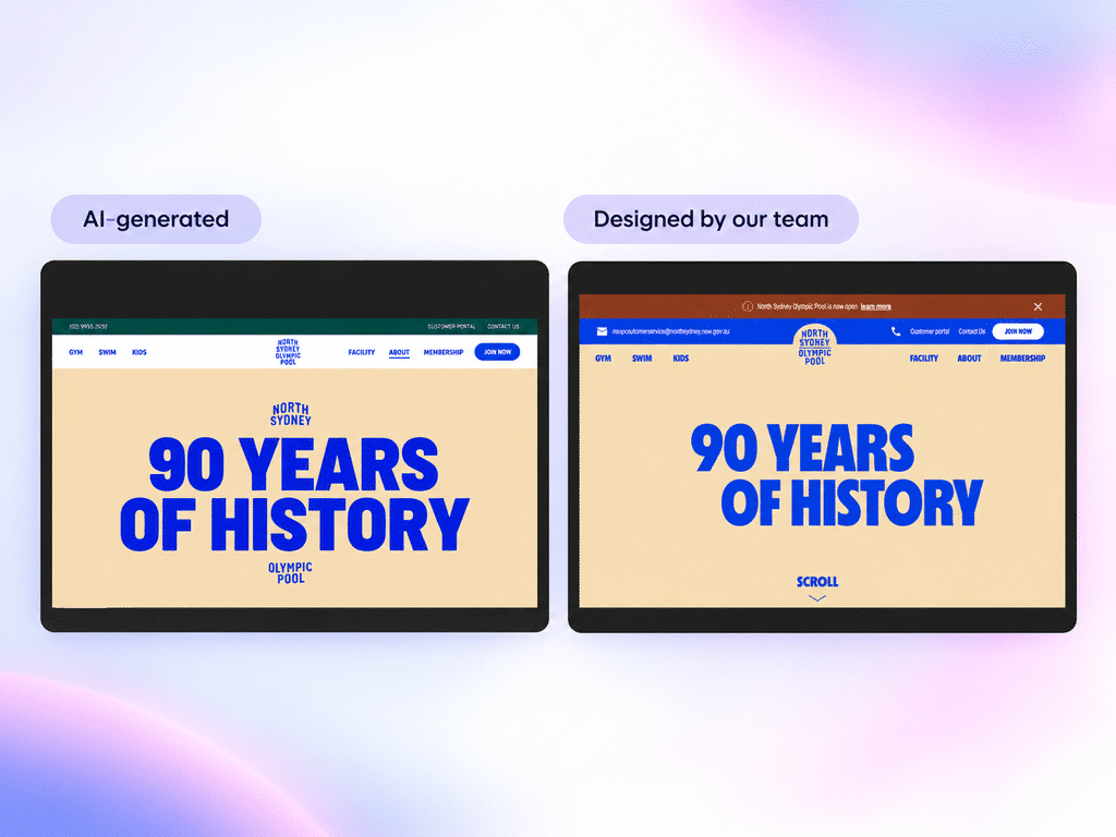
Then we ran a simple test.
We gave an AI tool the same brand guidelines, the same copy and the same images, with no internet access and no existing website to copy from.
We asked it to create the pool’s About Us page.
Then we compared that with the page our team designed.
The AI version did the job.
The content was there. The dates were there. The images were there.
But visually, it was mostly a series of sections stacked one after another. It also made some unusual decisions about what to emphasise and what to leave in the background.
Our version approached the same content differently.
The wave movement used throughout the website leads into the page. A swimming character, drawn in the brand style, moves into a timeline as you scroll.
The Sydney skyline appears in the background through the pool’s arches. A clock shows the actual time, and the page moves from day into night as the day progresses.
The pictograms from the original brand guidelines appear throughout the experience as well.
Same brief. Same guidelines. Same words.
Very different result.
What AI can’t decide for you
AI works by generating what is statistically likely based on the information and instructions it has been given.
That’s incredibly useful, but it also creates a limitation.
If you ask for a construction website without giving much more direction, there’s a good chance you’ll get something that looks like a typical construction website.
A hero section. An About page. A Services page.
Something polished and functional, but not necessarily distinctive.
AI doesn’t feel what your customers feel. It doesn’t have your history with the business. And it doesn’t automatically know which creative decision is right for your particular brand.
That judgement still needs to come from somewhere.
Anyone can generate a website now.
The harder question is: who decides whether it’s a good one?
Who decides whether it feels like your brand? Whether it gives customers the right experience? Whether the creative choices have a reason behind them?
That’s where experience and clear guardrails still matter.
Mac used a simple analogy in the webinar: everyone can draw, but not every drawing ends up in the gallery.
AI means the foundations matter more, not less.
When the rules are clear, AI can help produce good work very quickly.
When the rules are unclear, it can produce the wrong work just as quickly.
So what lasts?
Making things got cheap. Deciding did not.
It’s easier than ever to create something that looks polished.
That’s exactly why making good decisions matters more.
The advantage isn’t producing more things. It’s understanding what should be created, why it should exist and how it should connect back to the brand.
Clarity comes first.
Before anything goes onto a page or screen, you need a clear direction.
What should this brand be?
What is it trying to say?
How should it make people feel?
Those decisions need to come before the tools.
It’s easy to add animation, effects and visual polish to a design now. But the more important question is why you’re doing it and whether the choice still belongs to the brand.
The way I think about it is like building a house.
If the foundation is unstable and you keep building on top of it, eventually things start leaning and falling apart.
If the foundation is solid, you can make changes, experiment and add something new without losing what holds everything together.
For people working in creative industries, our role is still to ask the right questions.
To understand what the owner, directors and team are trying to achieve. To understand what the customer needs. And to find the core idea the brand is trying to express.
Design is deciding what something should become, then making it real.
AI can help with the making.
But deciding what should be made is still a human choice.
Where to start
If you’re already using AI in your brand or creative work, there are three practical places to begin:
- Find your brand guideline. If you don’t have one, start by putting your logo files, colours and colour codes, typefaces and other core assets into one place.
- Decide what’s fixed and what can flex. Your logo, core colours and typefaces will usually be fixed. Other elements may have more room to adapt.
- Give AI the rules before you give it the task. Provide the guideline and a few strong examples of work that genuinely represents the brand. Avoid feeding it old or inconsistent material.
A strong brand system doesn’t need to stop people from experimenting.
It gives them a foundation to experiment from.
And as AI becomes part of more creative work, that foundation is what helps everything you produce still feel like it came from the same business.
Watch the full webinar: Brand systems in the age of AI